Case study · Editorial design · 2026
A magazine about modern, nontraditional weddings for Gen Z and women in their 20s and 30s, printed and bound by hand, then rebuilt as an interactive website.
A student project. Stories and photos are placeholder content used for class.
My role
Concept, writing and editing, editorial design, typography, print production and web design
Timeline
10 weeks · Spring 2026
Course
Typography III & Information Architecture, with Katherine Hughes & Rita Ferreira
Tools
InDesign, Illustrator, Photoshop, Figma
The idea
Traditional bridal magazines are built on an idealized, luxury look. I wanted a magazine for weddings that look like the people in them: courthouse ceremonies, small budgets, rainy days and couples who do it their own way.
The audience is Gen Z and women in their 20s and 30s who follow fashion, art and social media. Five keywords guided every choice: nontraditional, editorial, bold, playful and expressive.
Before any spreads, I organized the content into sections and built a flexible grid. Type galleys tested how each typeface pairing handled headlines, body text and captions.
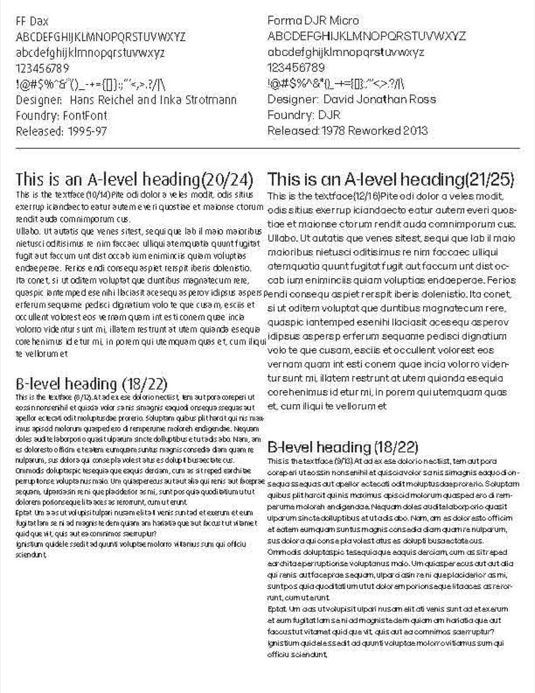
A type galley, comparing typefaces for headings and body text.
Testing hierarchy through size, weight and contrast.
I pushed each layout in a different direction, changing image scale, type emphasis and pacing, to see how far the grid could stretch while still feeling like one magazine.
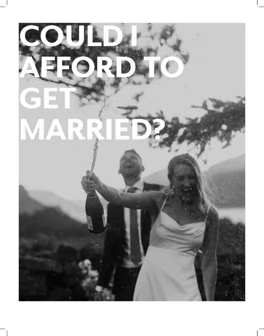
“Could I afford to get married?”: big type over a full-bleed photo.
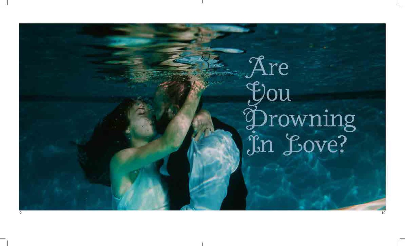
“Are you drowning in love?”: an underwater photo carrying the headline.
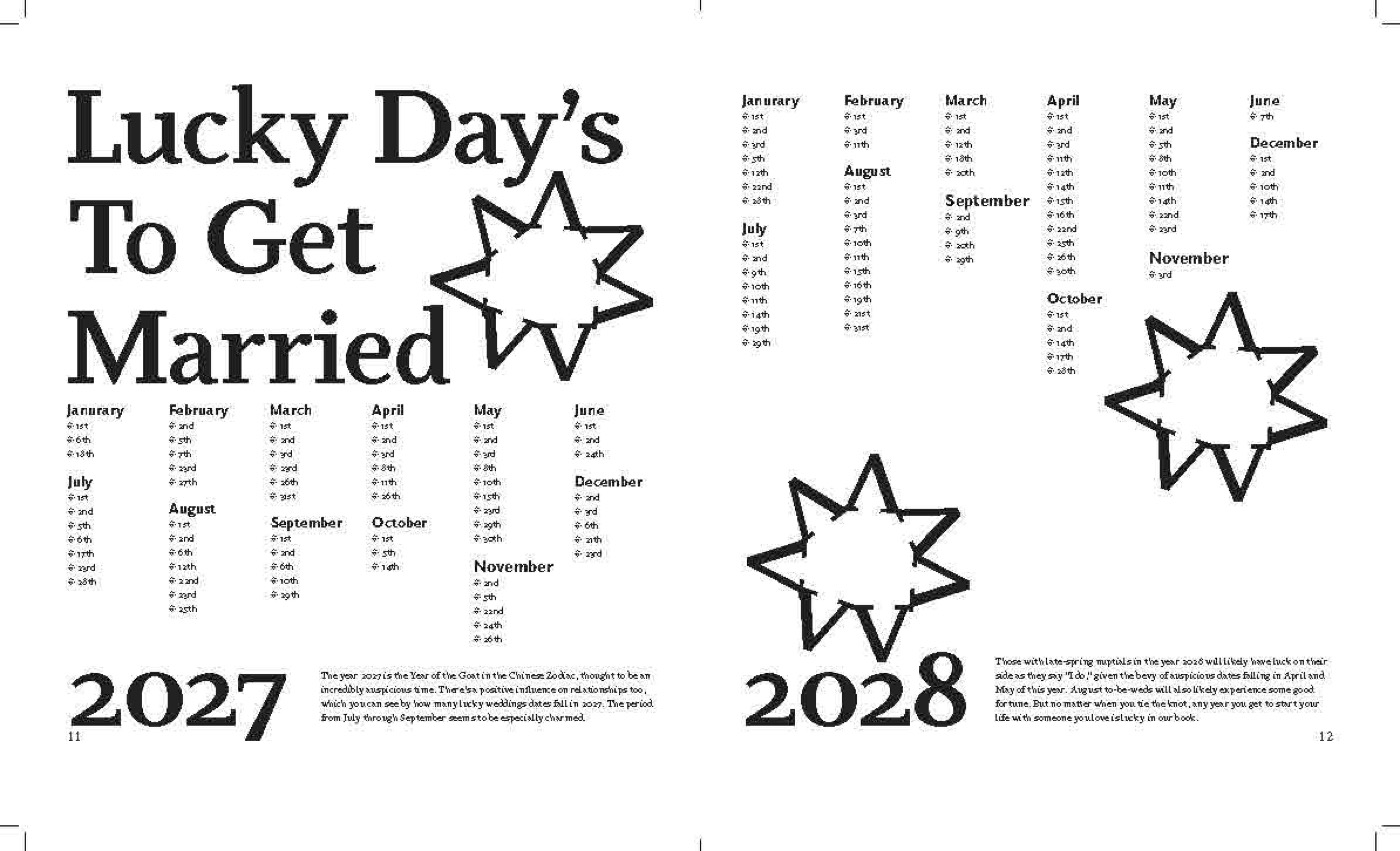
“Lucky days to get married”: dates as an illustrated list.
In critique I realized my 10 × 13 in format felt too big and too formal. A wedding magazine should feel intimate, so I resized everything to 8 × 9.5 in, and then rethought the color and ornament to match.
Before
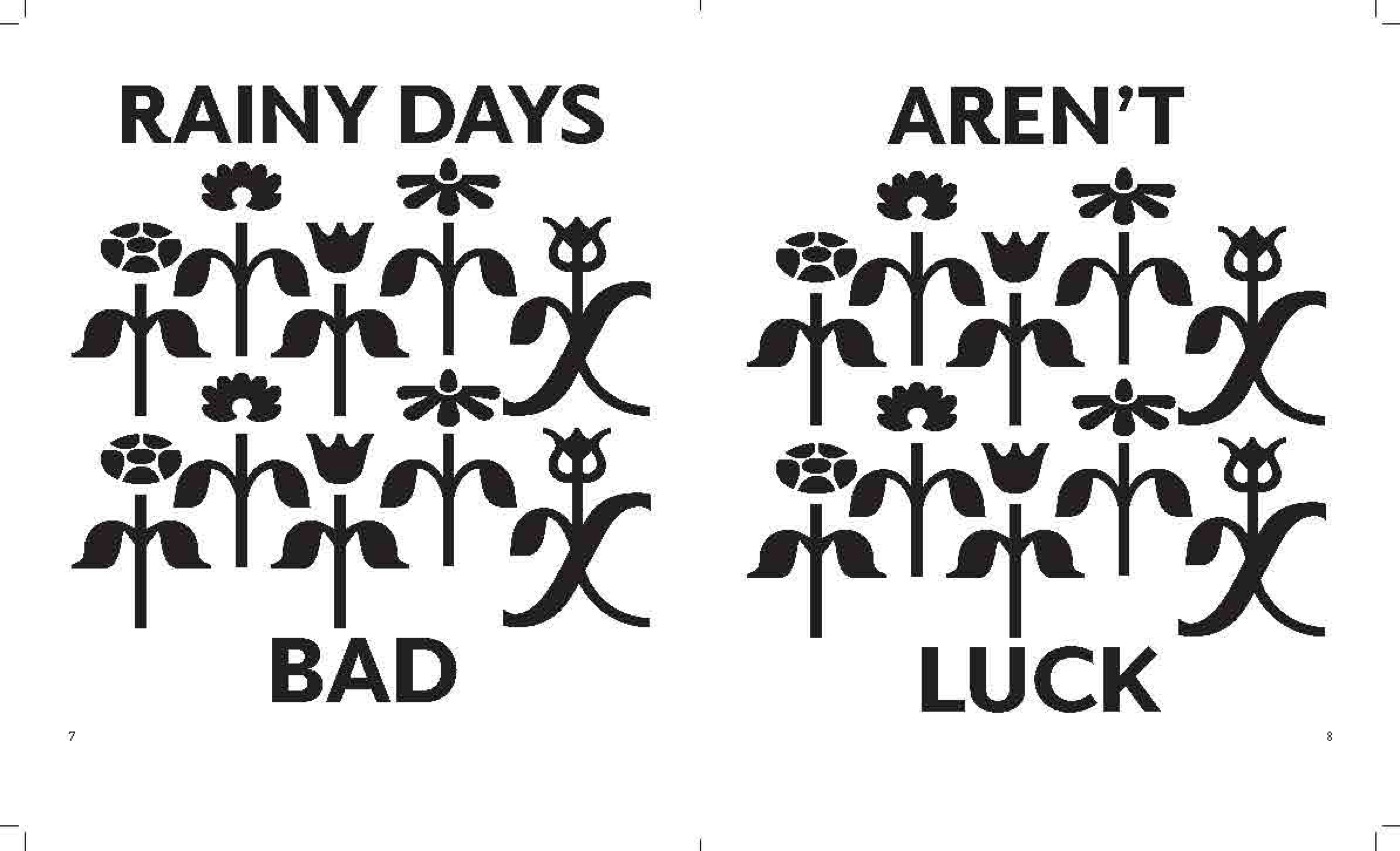
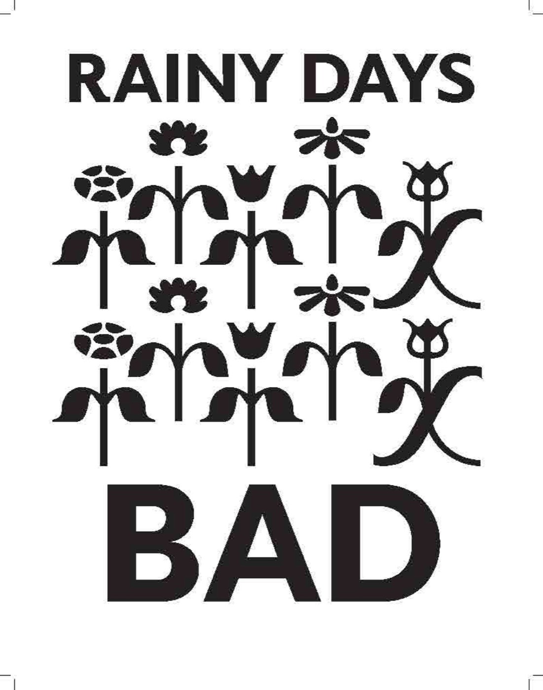
Week 3: “Rainy Days Aren’t Bad Luck,” black and white at 10 × 13 in.
After
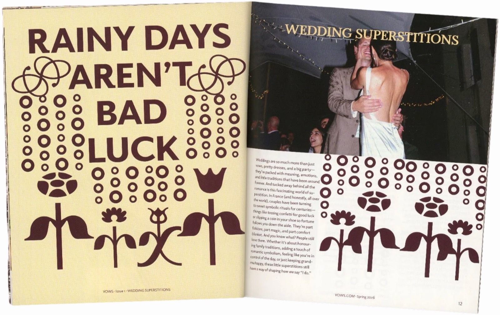
Printed: the same idea in wine on butter yellow at 8 × 9.5 in, paired with “Wedding Superstitions.”
Before
First draft: a single photo with the headline set over it.
After
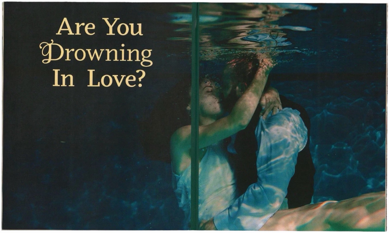
Printed: the photo bleeds across the spread, and the gold headline floats in the water.
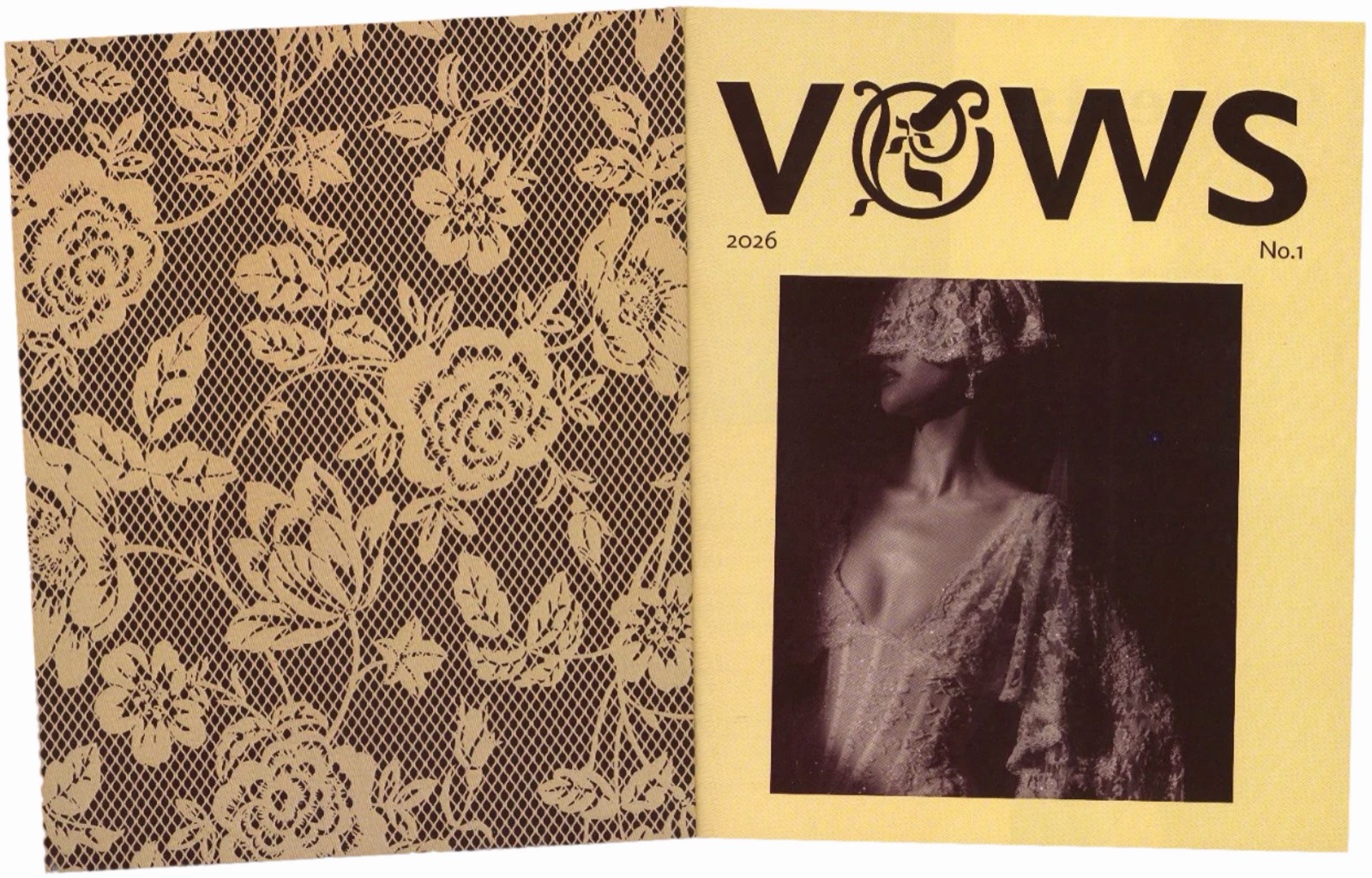
Romantic but not precious: wine, butter yellow and cream, lace and floral ornaments, and two typefaces with real personality.
Color
Wine
Primary: headlines, ornaments, lace
Butter
Panels and covers
Cream
Paper
Gold
Headlines on dark photos
Plum
Feature pages
Type
Display
Elido
A friendly, bold sans with matching ornaments, for the VOWS wordmark and big headlines like “Rainy Days Aren’t Bad Luck.”
Serif
Odile
A warm serif with decorative initials, for the contents, “Lucky Days” and long articles.
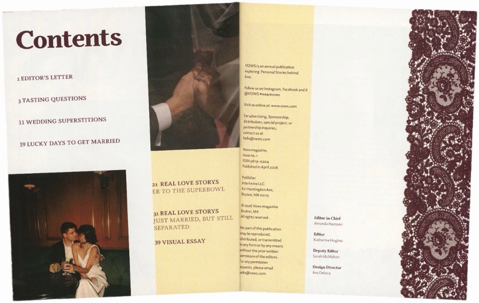
Contents and masthead, with the lace running down the edge.
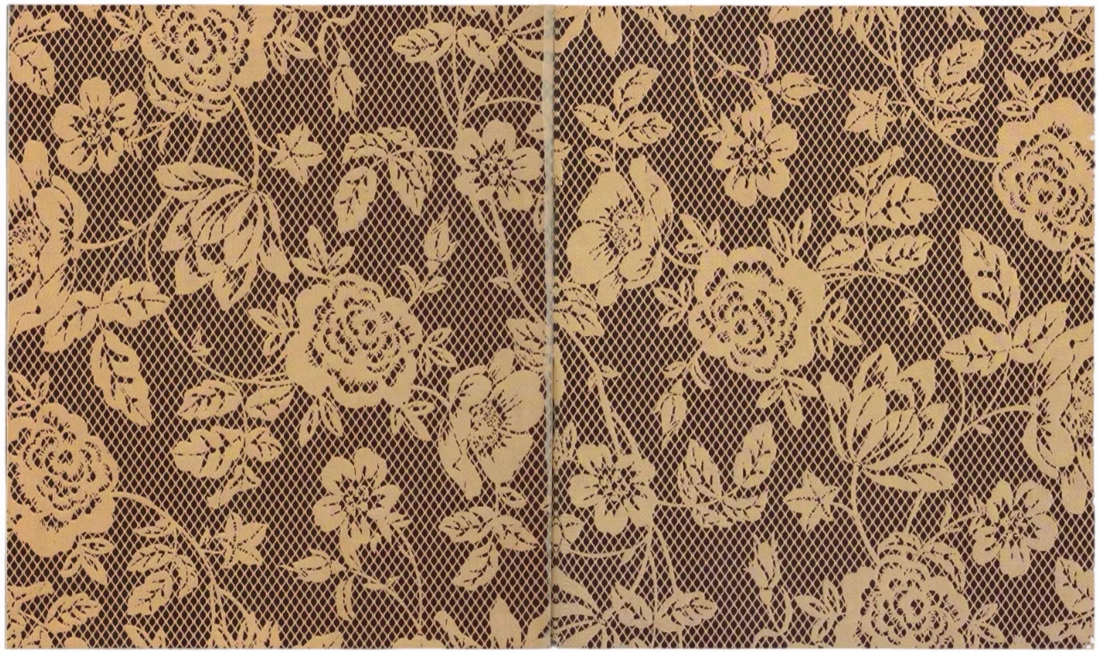
Lace endpapers inside the covers.
Cover, spine and back cover, front matter, two features, an interview, a visual essay and departments. I printed every page at full scale in black and white to check alignment, then printed, bound and trimmed the final copy myself.
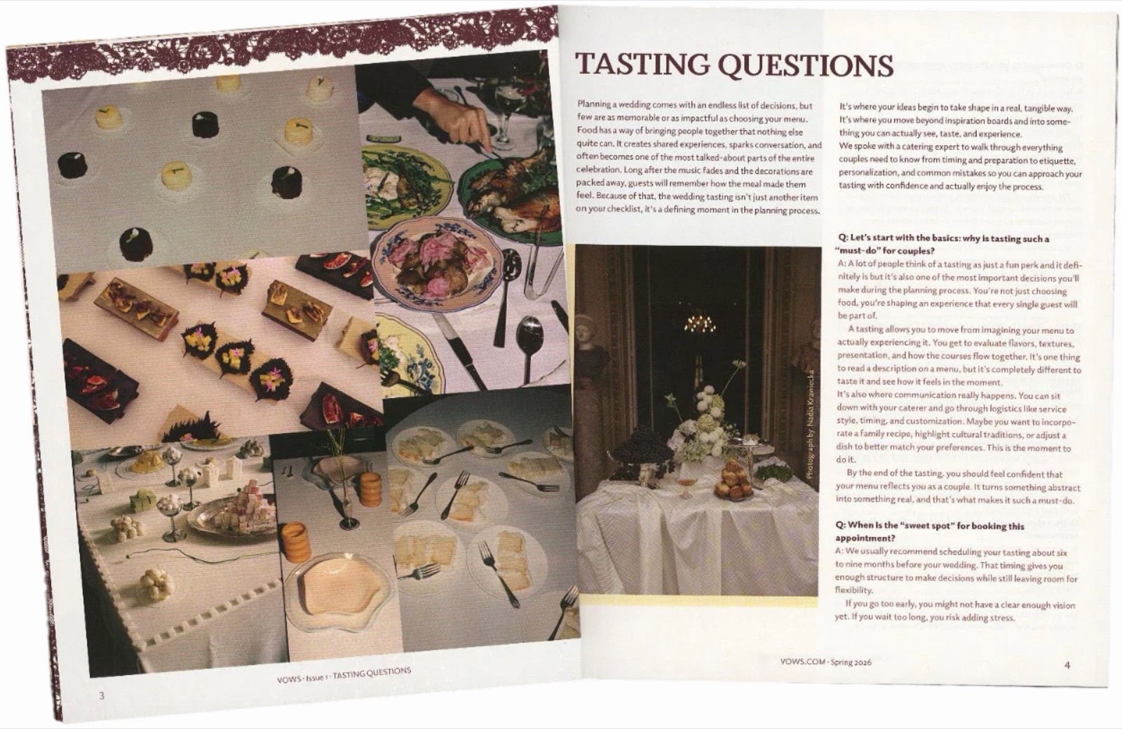
“Tasting Questions”: an interview with a caterer, opening on a grid of food photos.
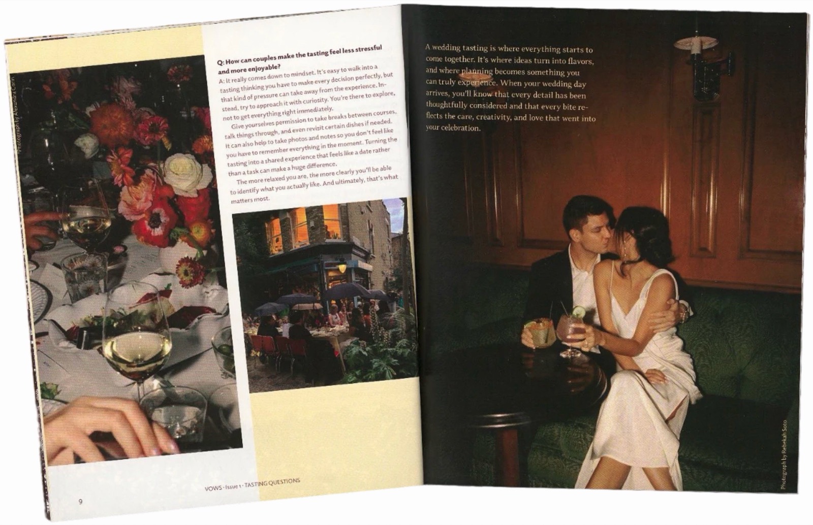
The interview closes on a full-page photo and a short pull paragraph.
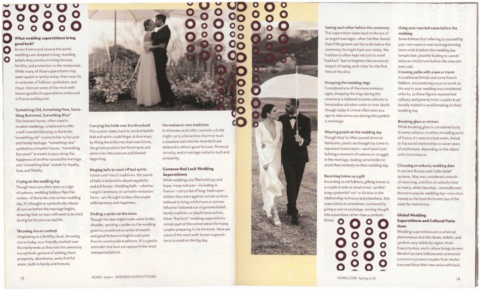
“Wedding Superstitions”: the raindrop pattern falls through the text and photos.
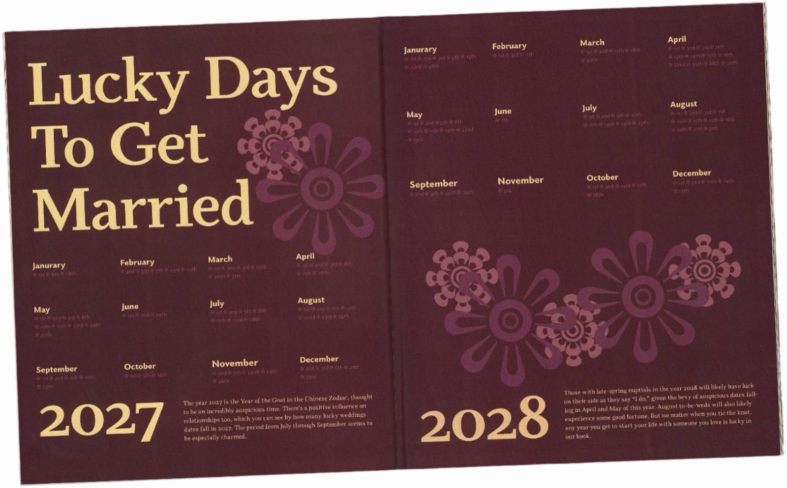
“Lucky Days to Get Married”: a 2027–2028 calendar in gold on wine.
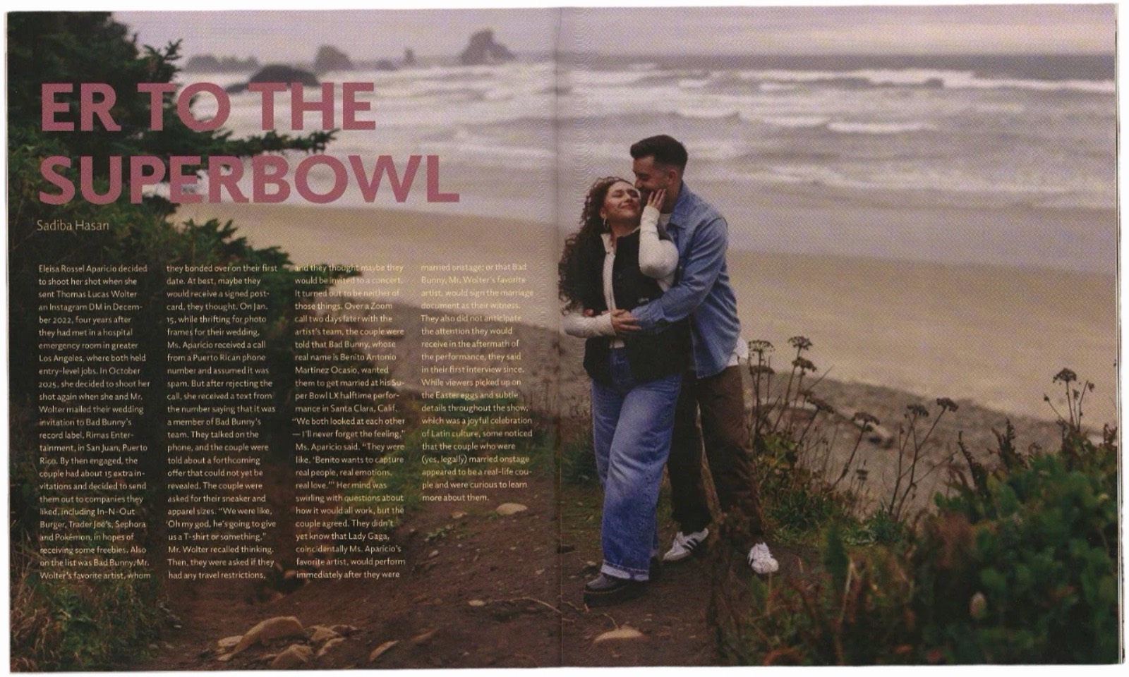
“ER to the Super Bowl”: a real love story set over a full-bleed beach photo.
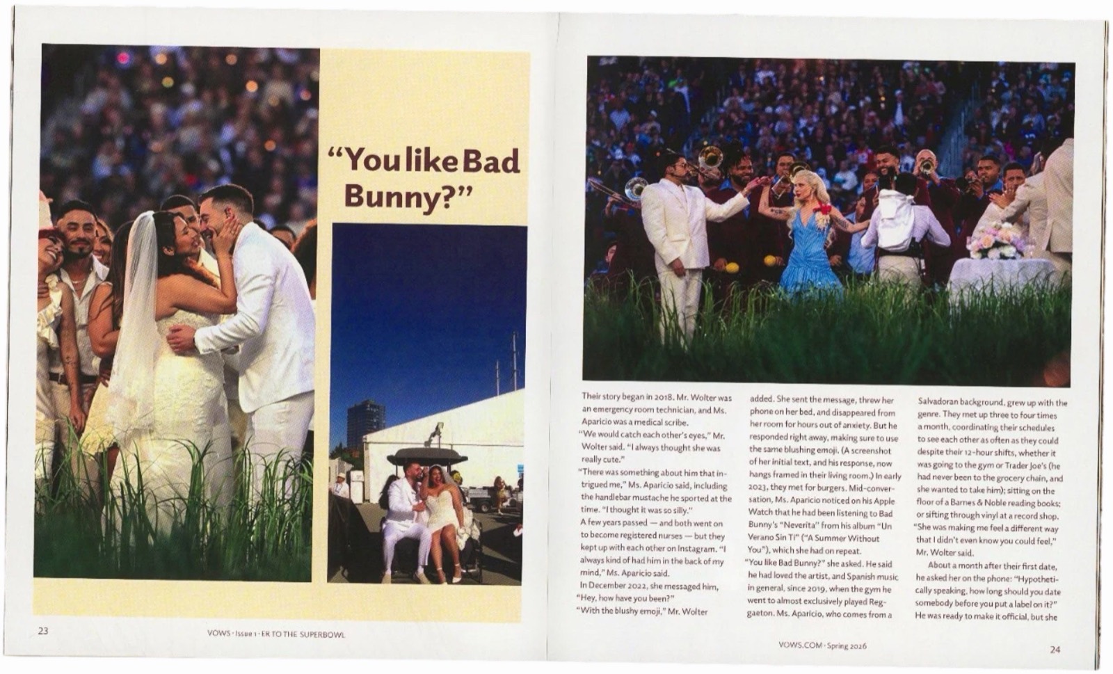
A pull quote, “You like Bad Bunny?”, breaks up the story.
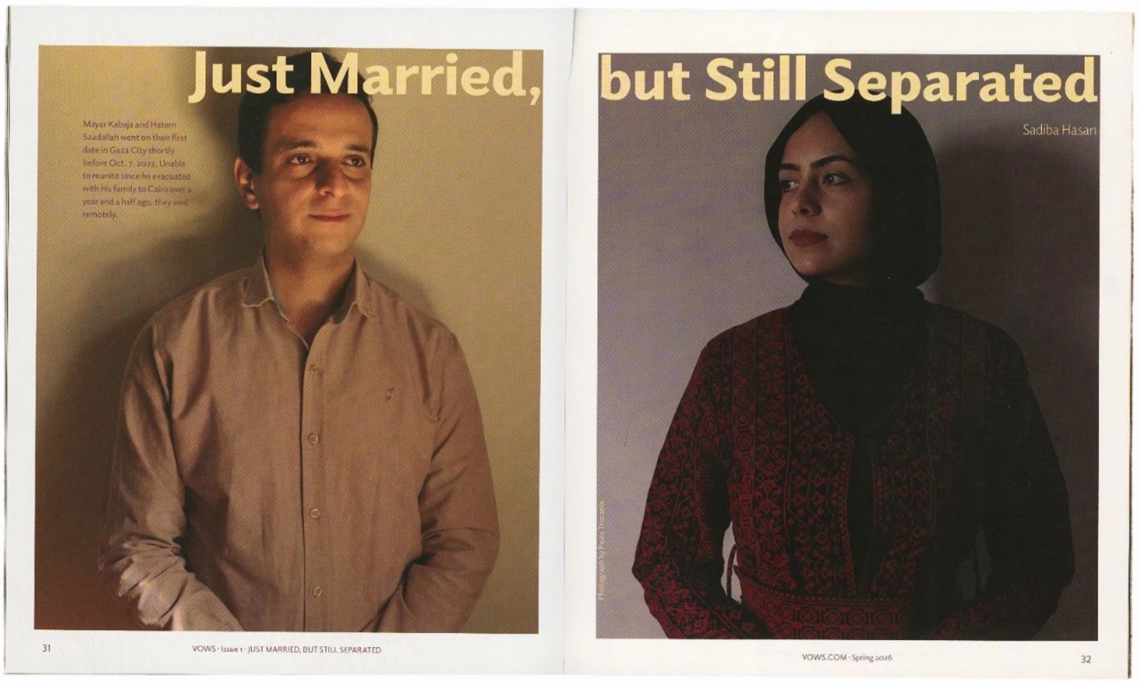
“Just Married, but Still Separated”: the headline splits across two portraits.
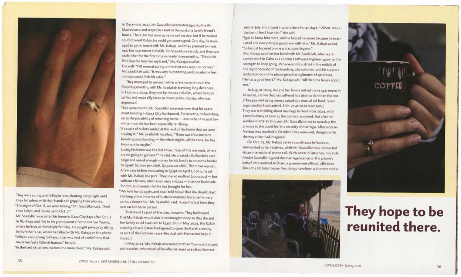
Butter panels hold the long text, with a closing pull quote.
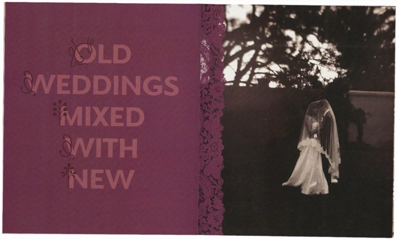
“Old Weddings Mixed With New,” the visual essay opener, with ornament initials.
The second half of the project turned the magazine into a seven-page website. I mapped a sitemap, made black-and-white wireframes, then rebuilt each section for scrolling: bigger type, narrower columns, full-bleed images and oversized pull quotes.
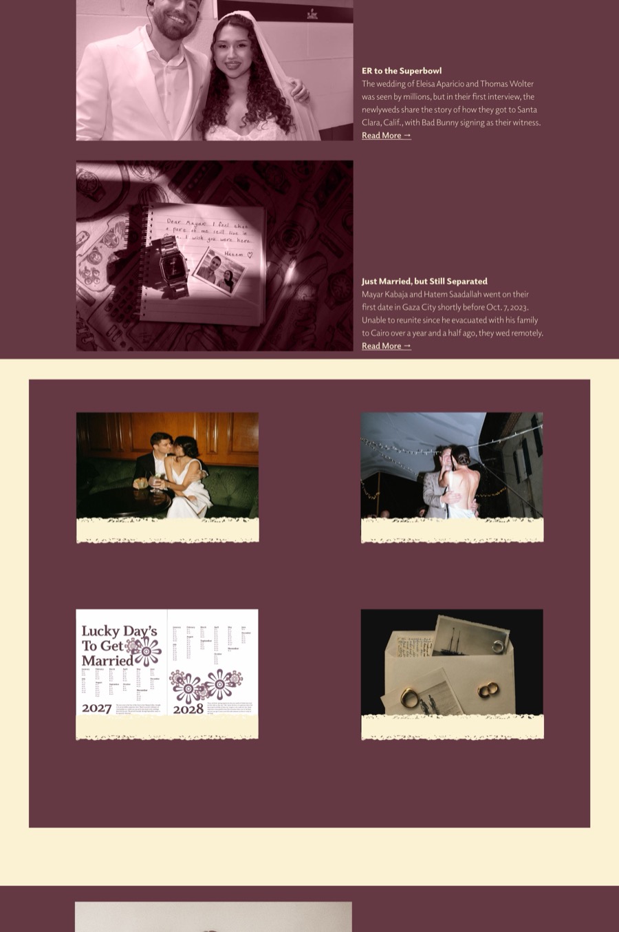
The homepage, introducing the issue.
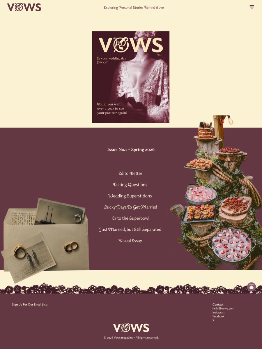
The issue landing page: contents, editor’s letter and contributors.
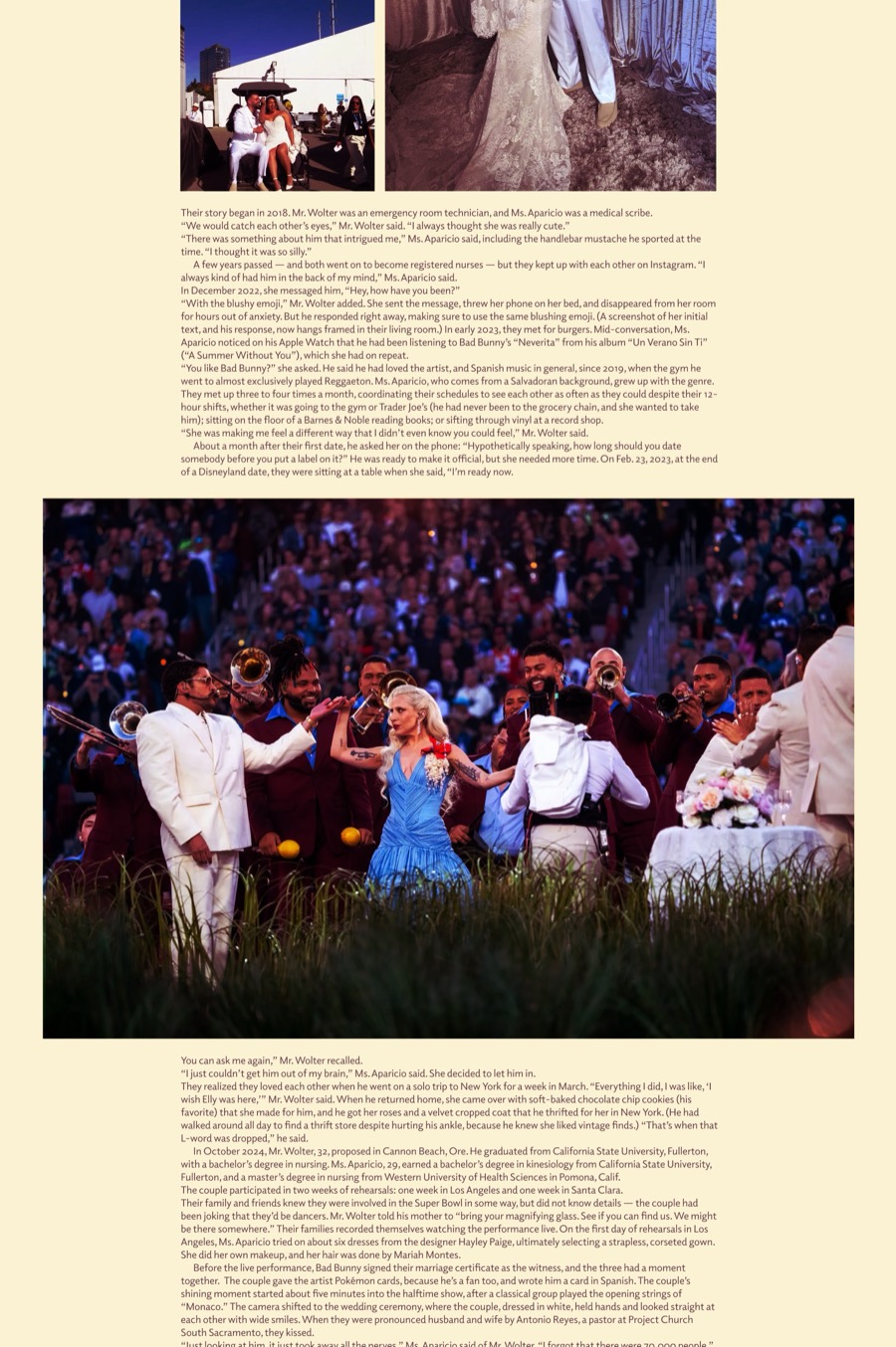
The interactive feature, where scrolling sets the pace.
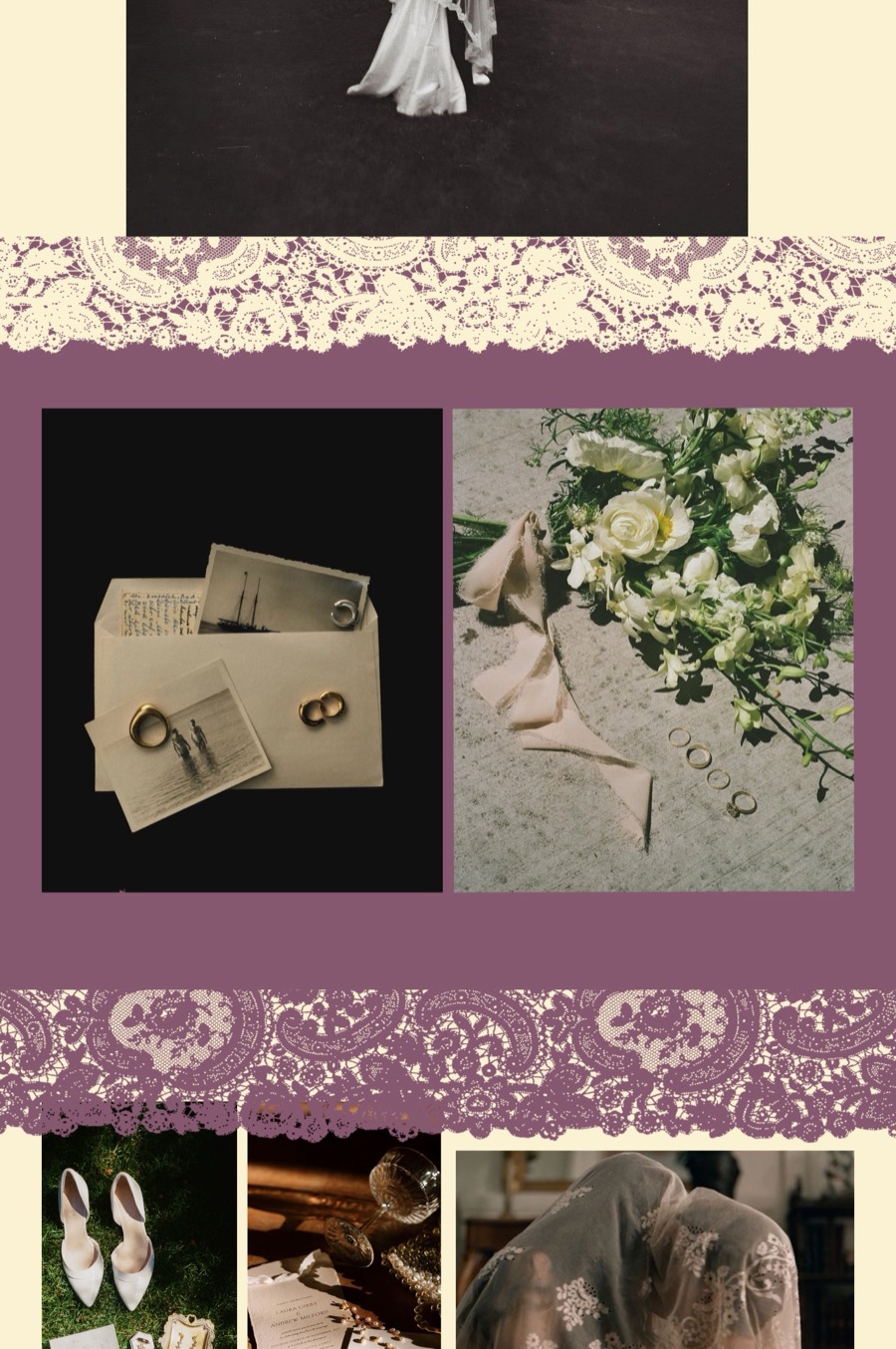
The visual essay, adapted for screen.
Process
Week 1
Theme, audience, keywords and a flexible grid.
Week 2
Type galleys for headlines, body text and captions.
Week 3
Critique moved the format from 10 × 13 to 8 × 9.5 in.
Weeks 4–5
Full text, front matter, cover and spine; printed, bound, trimmed.
Weeks 6–10
Sitemap, wireframes, then scroll-based storytelling.
Reflection
“The project started to come together as a complete system rather than a series of individual layouts.”
What worked
Resizing the magazine. A smaller page made every story feel more personal, and it changed how I designed the rest.
What I learned
Print and screen need different pacing. On the website I had to slow readers down with scale, white space and big quotes.
Next time
I’d plan the website alongside the magazine, so ideas like the scrolling feature could shape the print version too.
Next project
The Bench Film Festival →