Case study · Brand identity · 2025
An identity for a new film festival of true crime, documentary and psychological drama, designed as a study of judgment and truth.
A fictional festival for a student project. Film stills and the newspaper masthead are for demonstration only.
My role
Concept, naming, identity, 24-page program, poster and digital applications
Timeline
6 weeks · Fall 2025
Course
Graphic Design 2: Making Meaning, with Joe Quackenbush
Tools
Illustrator, InDesign, Photoshop, Figma
The brief
Graphic Design 2 asked us to create a festival from scratch: a name, a mission, a lineup, a visual identity and a printed program. I chose the space where true crime, documentary and psychological drama meet.
My mission statement: to show how true stories can be cinematic, emotional and thoughtful, beyond just headlines. The audience: film fans, true-crime fans, justice-minded viewers and curious people who want more than the sensational version.
I looked at three existing festivals (the UK’s True Crime Film Festival, True Crime Fest in Europe and the Toronto True Crime Film Festival), curated a 15-film lineup, and made three moodboards to test different moods.
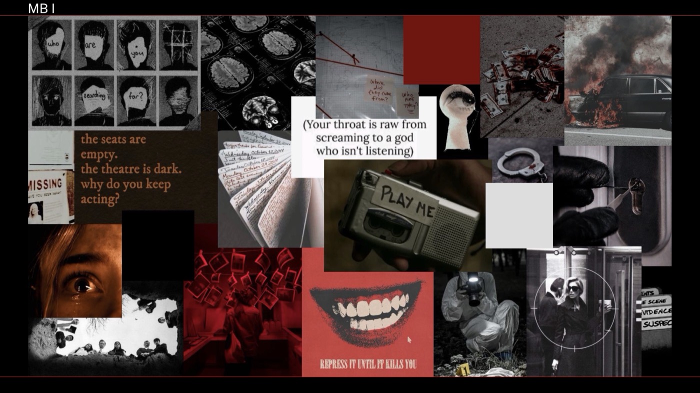
Moodboard I: crime-scene evidence, case files and a red-and-black thriller mood.
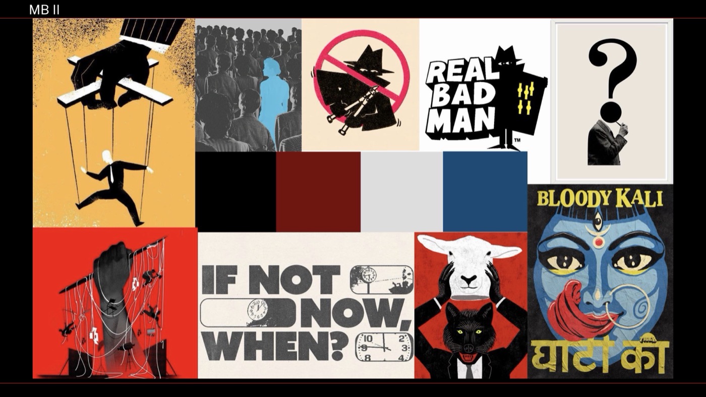
Moodboard II: bold editorial illustration with a bit of satire.
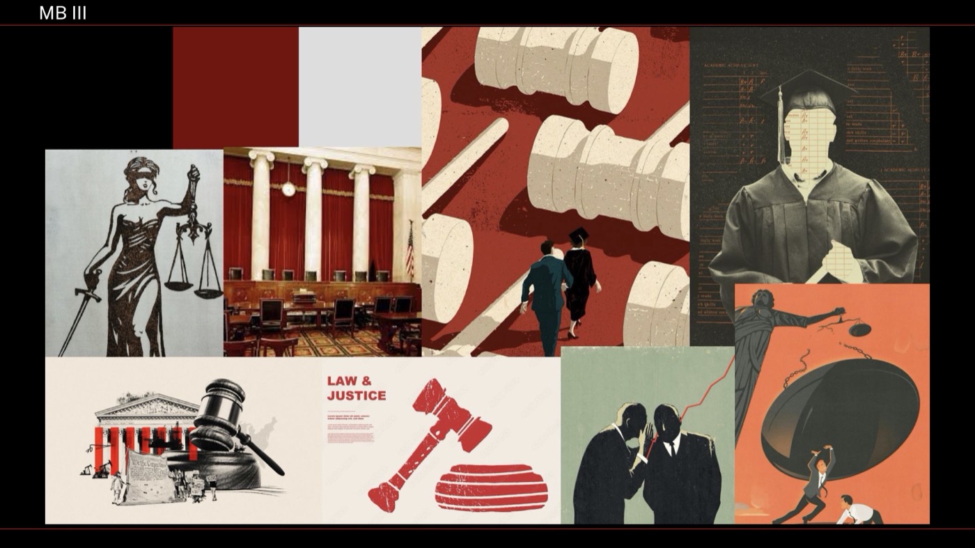
Moodboard III: the courtroom, with gavels, scales and Lady Justice. This one became the final direction.
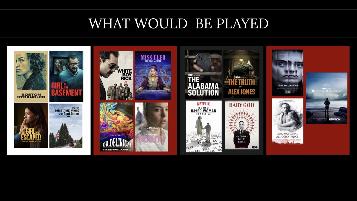
The proposed lineup, from Boston Strangler and Girl in the Basement to The Alabama Solution and The Truth vs. Alex Jones.
My first concept, The Evidence Room, leaned on crime-scene clichés: black, red, police tape and case files. After critique, I reset the whole idea around the courtroom. The festival became less about the crime and more about judgment.
Before
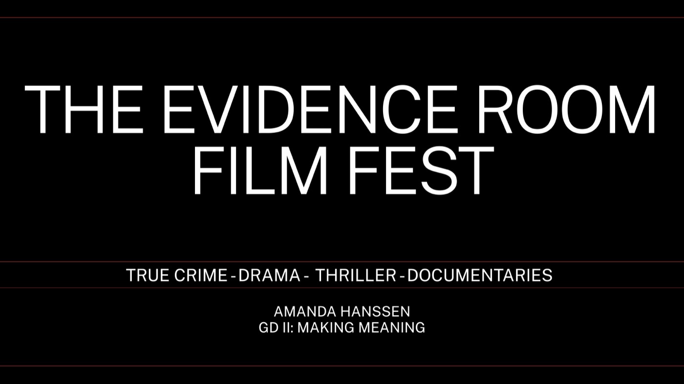
Week 1: The Evidence Room, a stark white sans on black with a forensic red line.
After
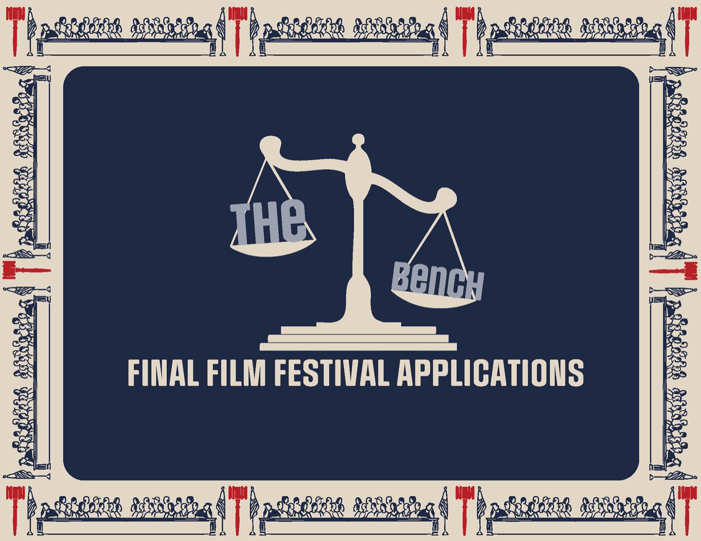
Week 6: The Bench, with navy, aged cream and a hand-drawn scale.
I drew 100 wordmark variations, exploring redacted and forensic letterforms, then refined three directions in Illustrator so they’d hold up from a ticket stub to a poster.
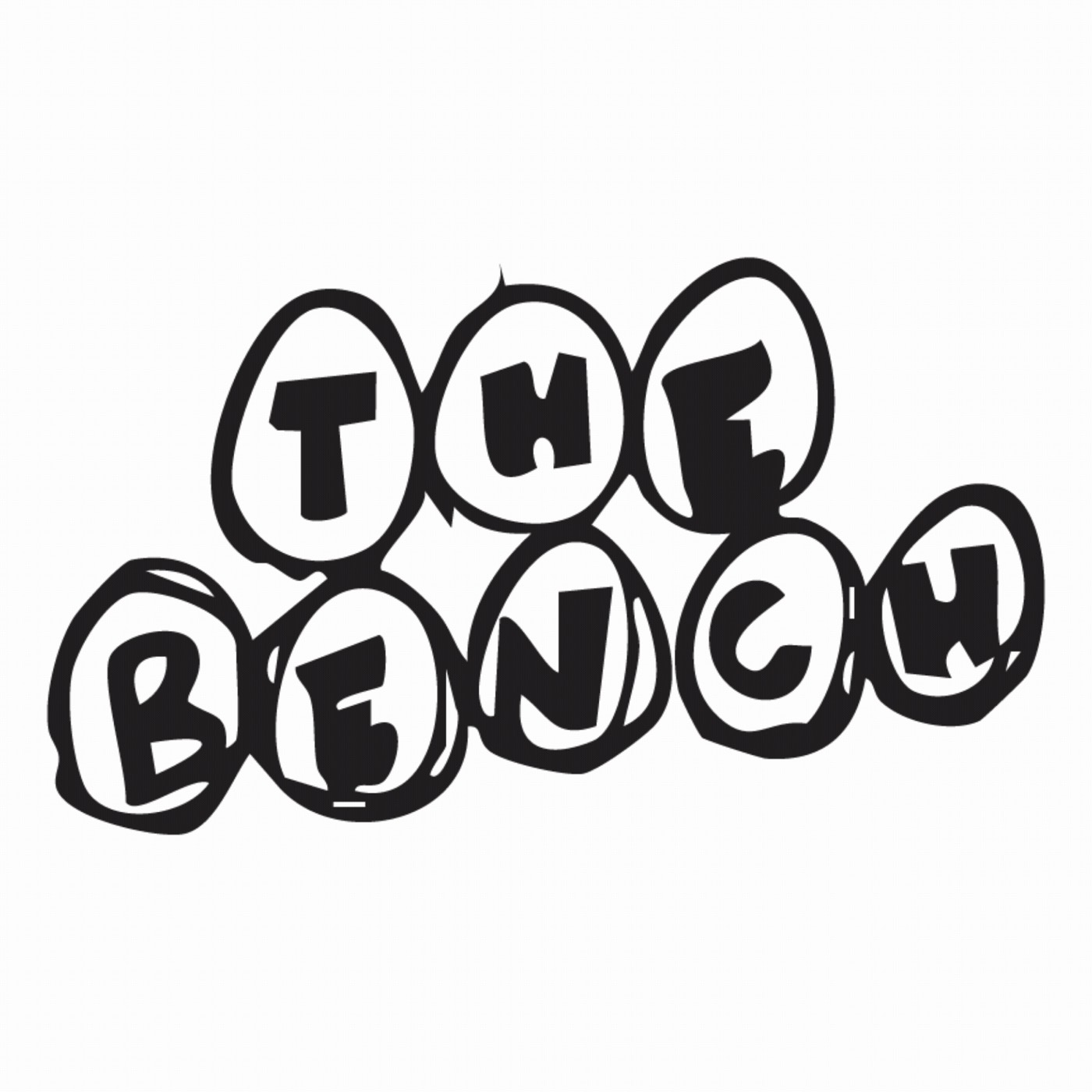
An early hand-drawn wordmark: playful, but too light for the subject.
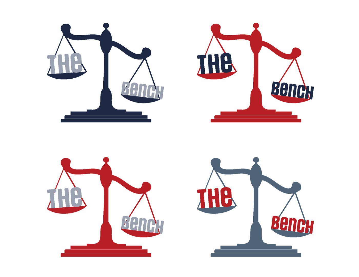
The final scale mark, tested in the brand colors.
Every choice points back to one idea, a formal judicial dossier: authoritative colors, document-like paper and type that reads like a court transcript.
Color
Pantone 533 C
Primary: authority
Pantone 468 C
Aged document cream
Pantone 3546 C
Accent: tension, used sparingly
Pantone 4975 C
Deep shadow
Pantone 7544 C
Secondary type
Type
Display
Social Gothic
Condensed, slightly rough capitals that feel stamped and urgent, for titles and the wordmark.
Text
Paralucent
A clean, geometric sans for synopses, schedules and credits, like a court transcript.
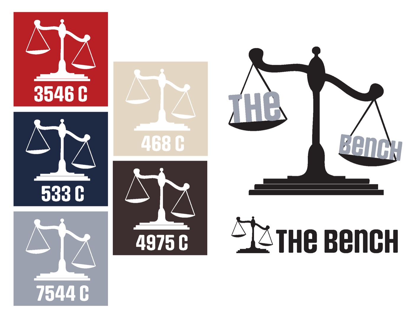
The scale mark in all five Pantone colors.
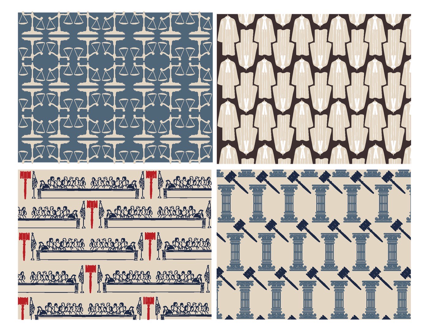
Gavel and column patterns, used as borders across every piece.
The program had to hold a lot: 15 films, three days, synopses, ratings, quotes and showtimes. My first drafts were loud; the final version is calmer, so the information can do the work.
Before
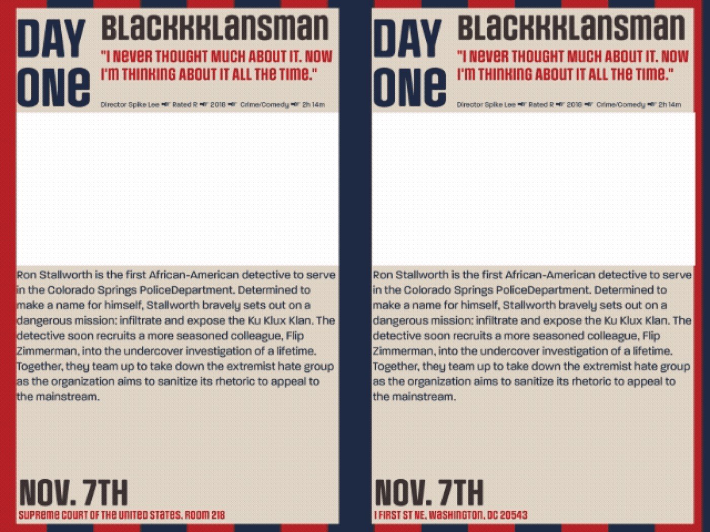
First draft: red, white and blue film pages with heavy headers.
After
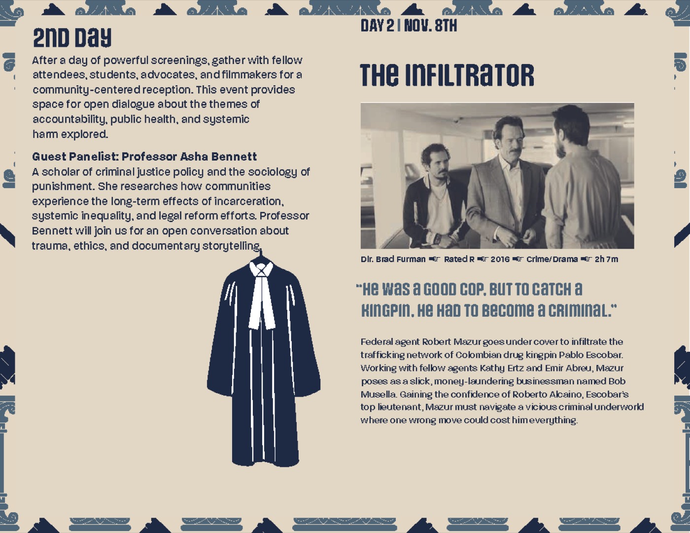
Final spread: cream pages, gavel borders and a steady grid.
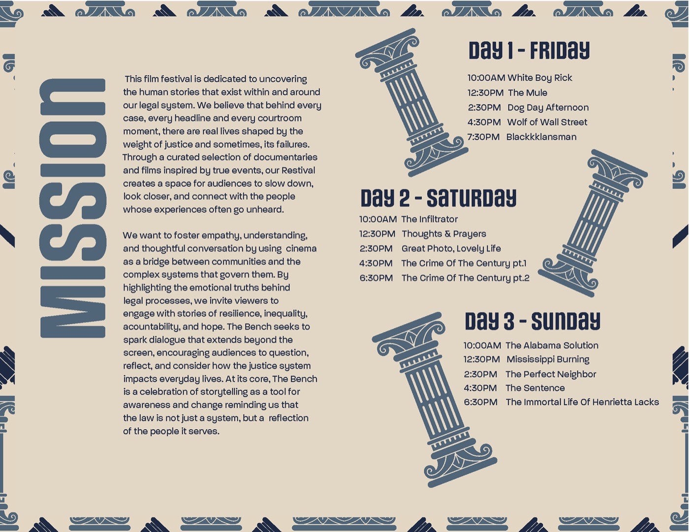
The mission and the three-day schedule.
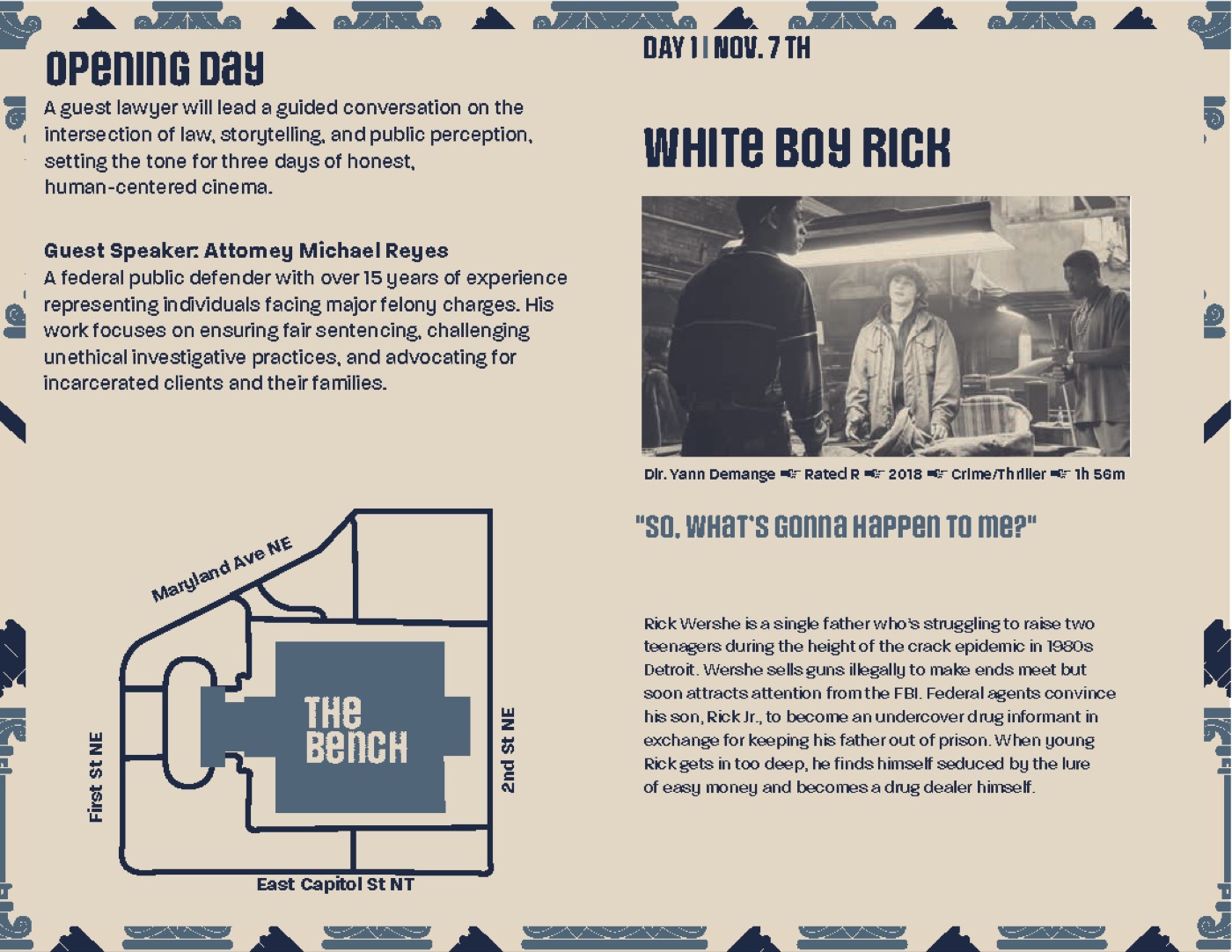
Opening day, with a map of the venue.
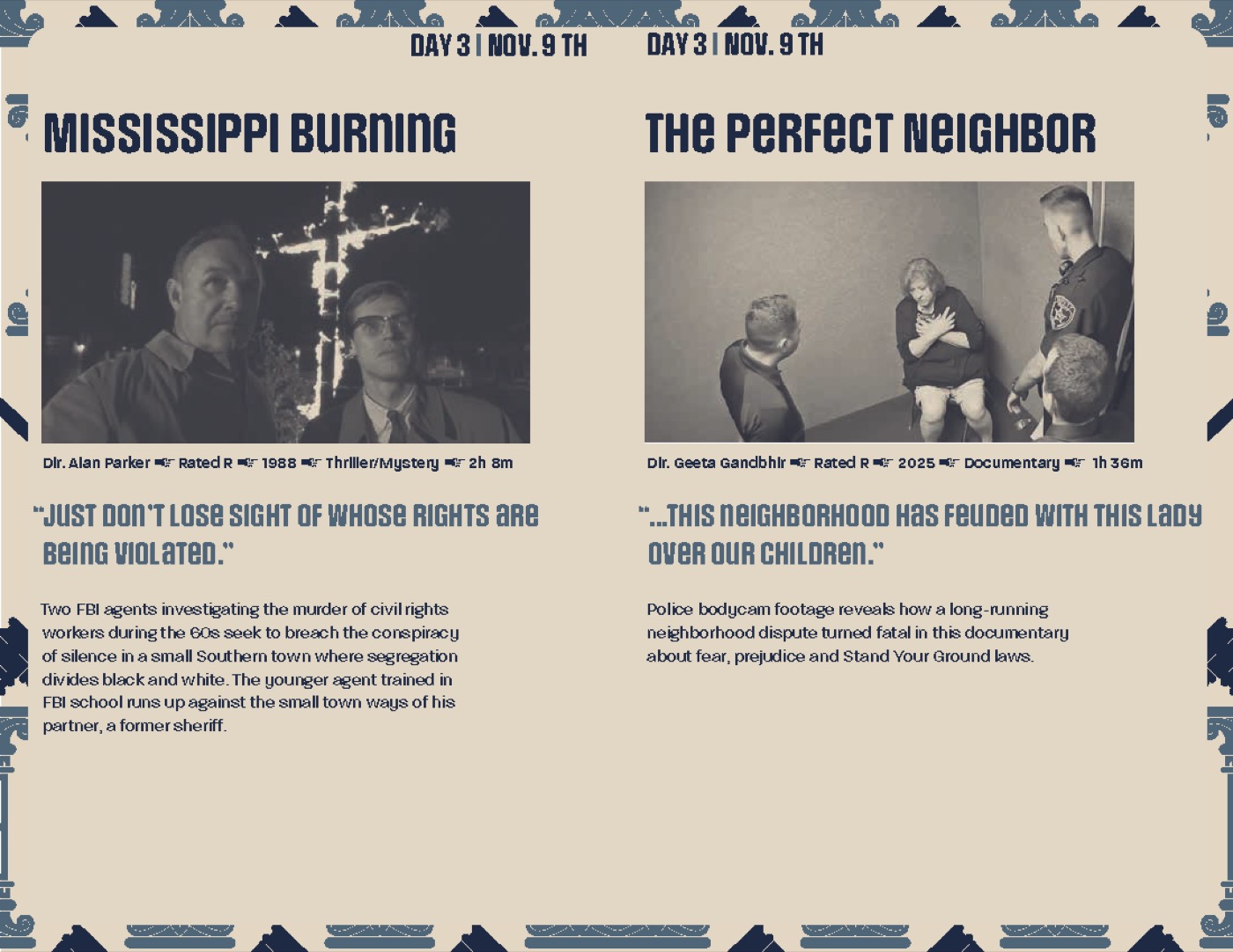
Day 3: each spread pairs two films with stills, quotes and details.
Process
Week 1
Mission, visual thesis, 15-film lineup and three moodboards.
Week 2
100 wordmarks exploring redacted and forensic letterforms.
Weeks 3–4
Three logo directions refined and 10 program sketches.
Week 5
A new concept built around judgment and the courtroom.
Week 6
Grid, gavel borders and the scale icon across every touchpoint.
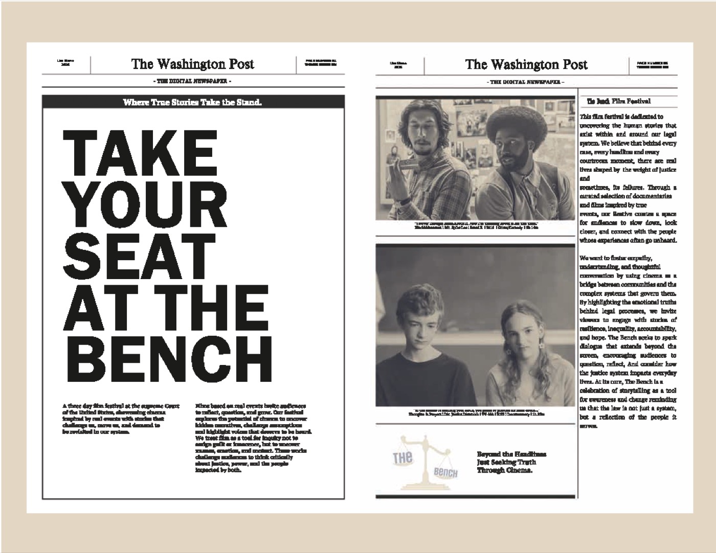
A newspaper ad: “Take your seat at the bench.”
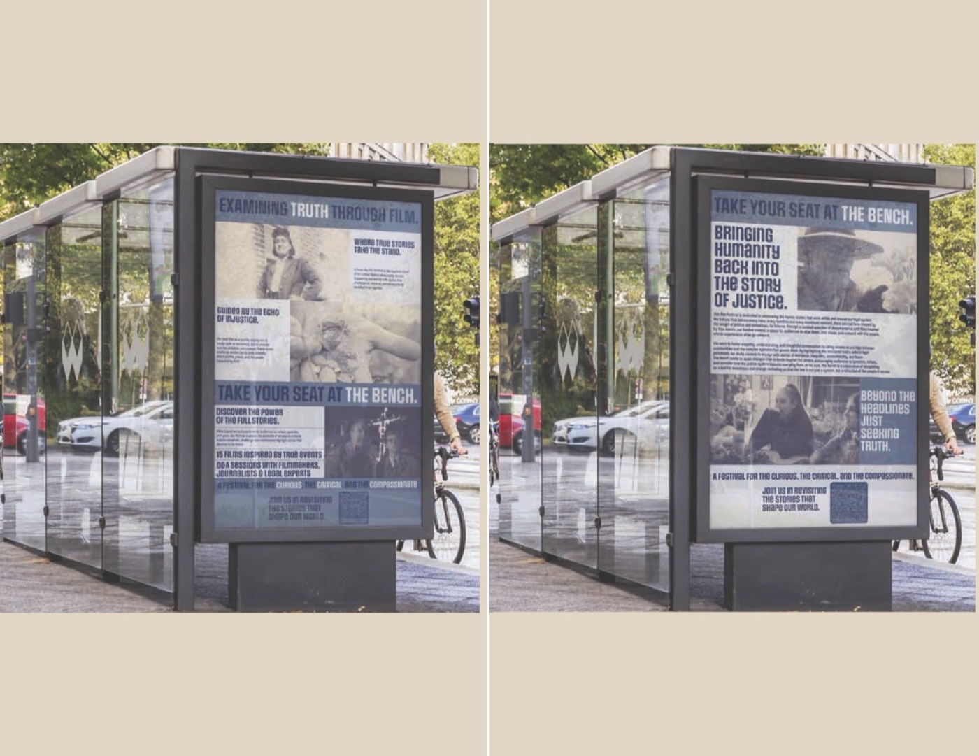
Posters in a bus shelter.
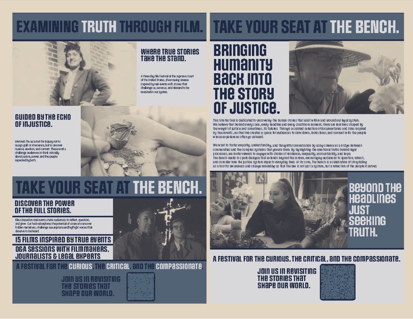
A poster series pairing film stills with the festival’s lines.
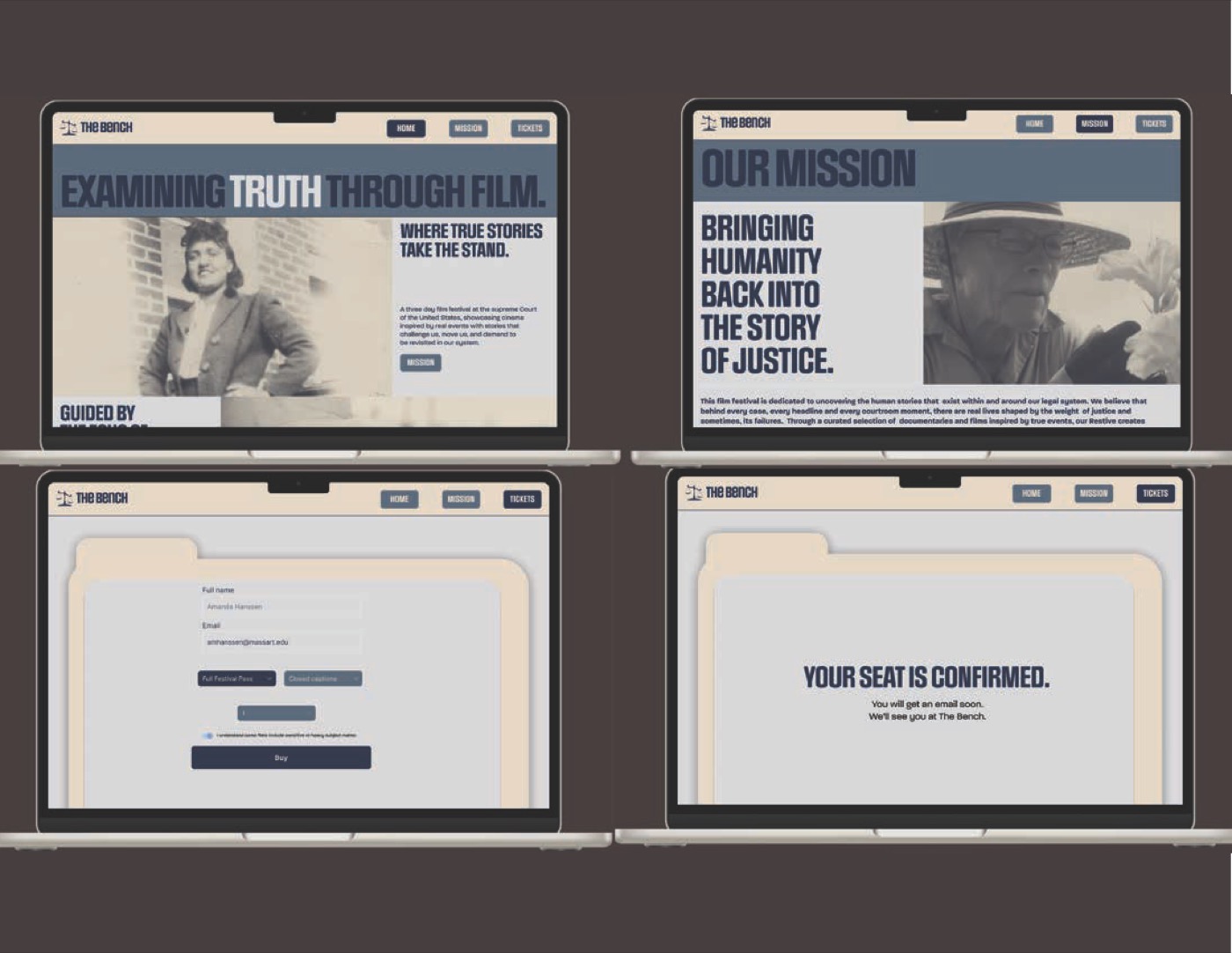
Website screens for tickets and the lineup.
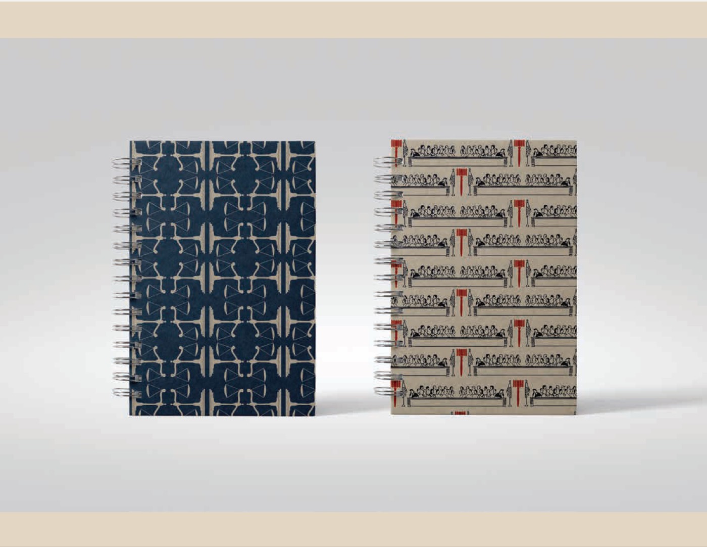
A notebook wrapped in the gavel pattern.
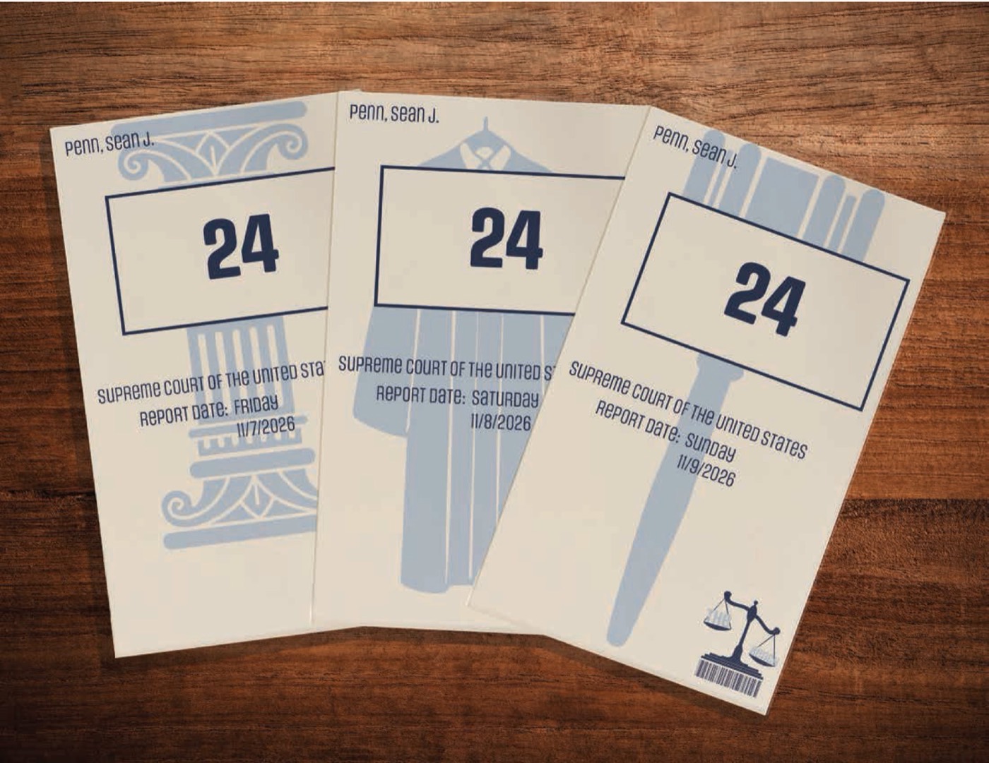
Tickets for each festival day.
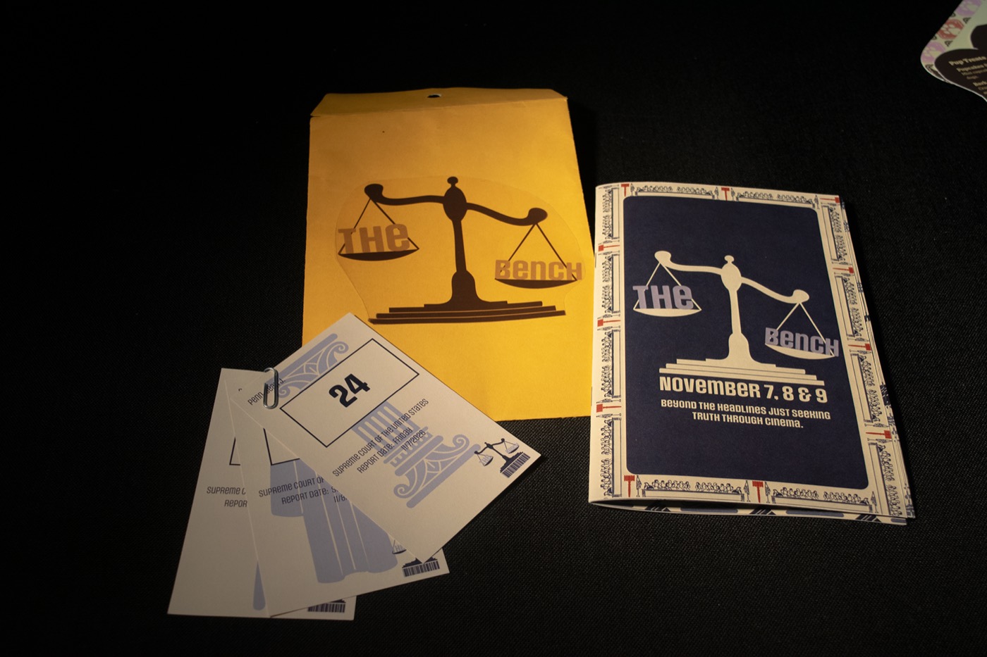
The printed program, envelope and tickets.
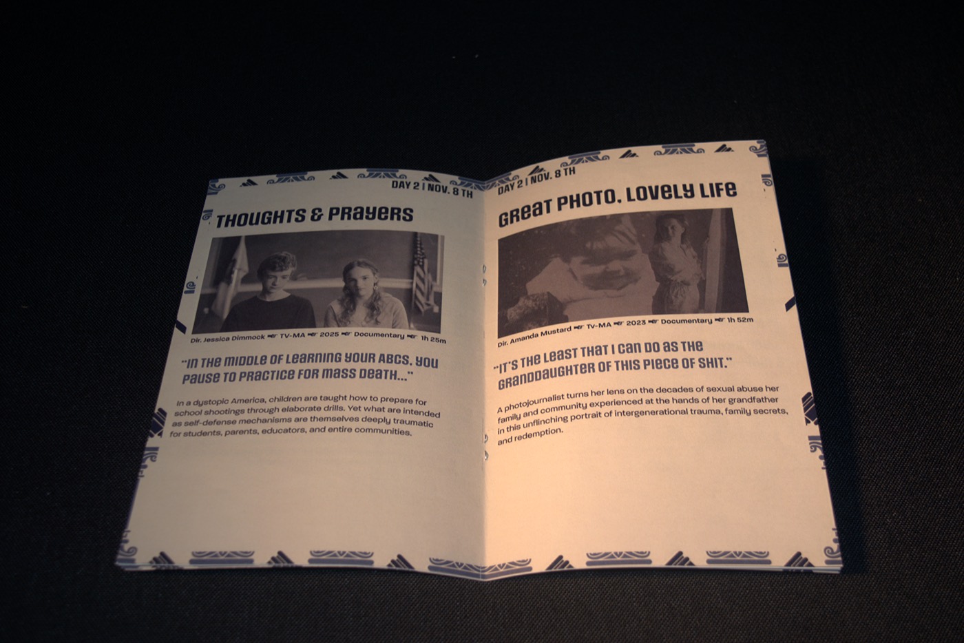
Inside the printed program.
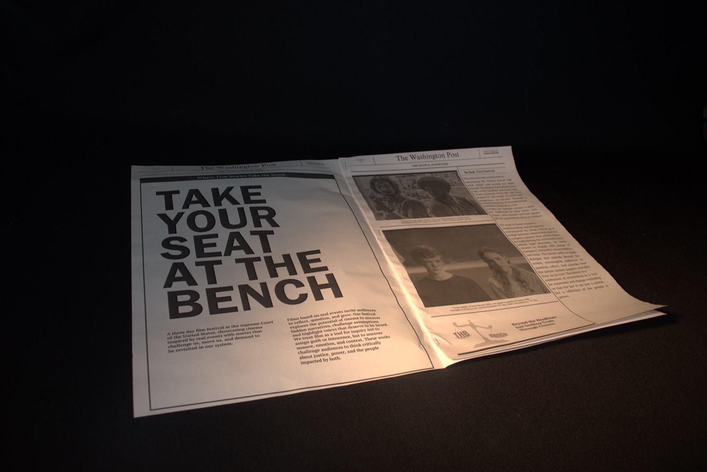
The printed newspaper ad.
Reflection
“A strong metaphor does more than a strong image.”
What worked
Resetting the concept in week 5 was scary, but it gave every piece one clear idea, judgment, and after that each decision got easier.
What I learned
A strong metaphor does more than a strong image. The scale, the bench and the gavel all point back to the same question.
Next time
I’d test my concept on people earlier, before spending weeks on a direction, and push the website further.
Next project
Paws & Pastries →