Case study · Brand identity · 2025
A brand for a dog-friendly café in Carmel-by-the-Sea, with treats for people and pups: name, logo, menus and a 24 × 36 in poster.
A fictional café for a class project.
My role
Brand strategy, naming, logo, type system, menus and poster
Timeline
7 weeks · Fall 2025
Course
Graphic Design 2: Making Meaning, with Joe Quackenbush
Tools
Illustrator, InDesign, Photoshop, Figma
The brief
Graphic Design 2 asked us to invent a restaurant and build its whole brand. I started with a mind map around food memories, the smells, places and people tied to eating, and kept coming back to slow mornings, pastries and dogs under the table.
That became Paws & Pastries: “Where sweet treats and wagging tails come together.” A café with a shaded patio, water bowls and leash hooks, a dog park out back, weekly events with shelter dogs, and a menu for both people and pups.
I set the café in Carmel-by-the-Sea, a storybook village on California’s Monterey Peninsula known for being dog friendly. Two moodboards tested the feeling, and two personas kept the brand grounded in real people.
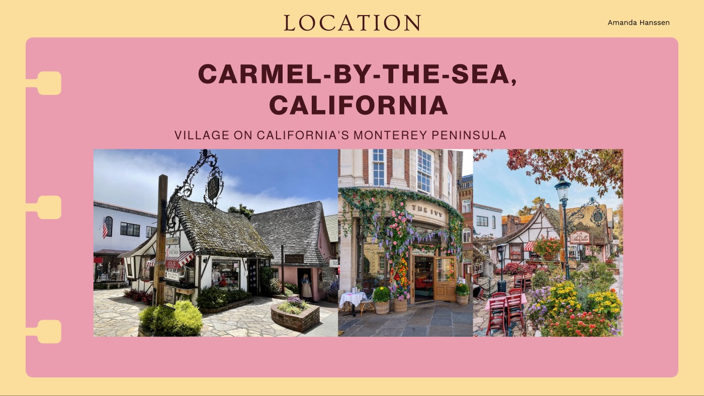
The location: Carmel-by-the-Sea, a dog-friendly village on the Monterey Peninsula.
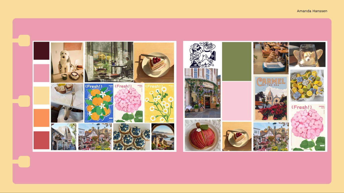
Two moodboards: warm pastries, cottage storefronts and dogs at the table, in plum, pink, butter and coral.
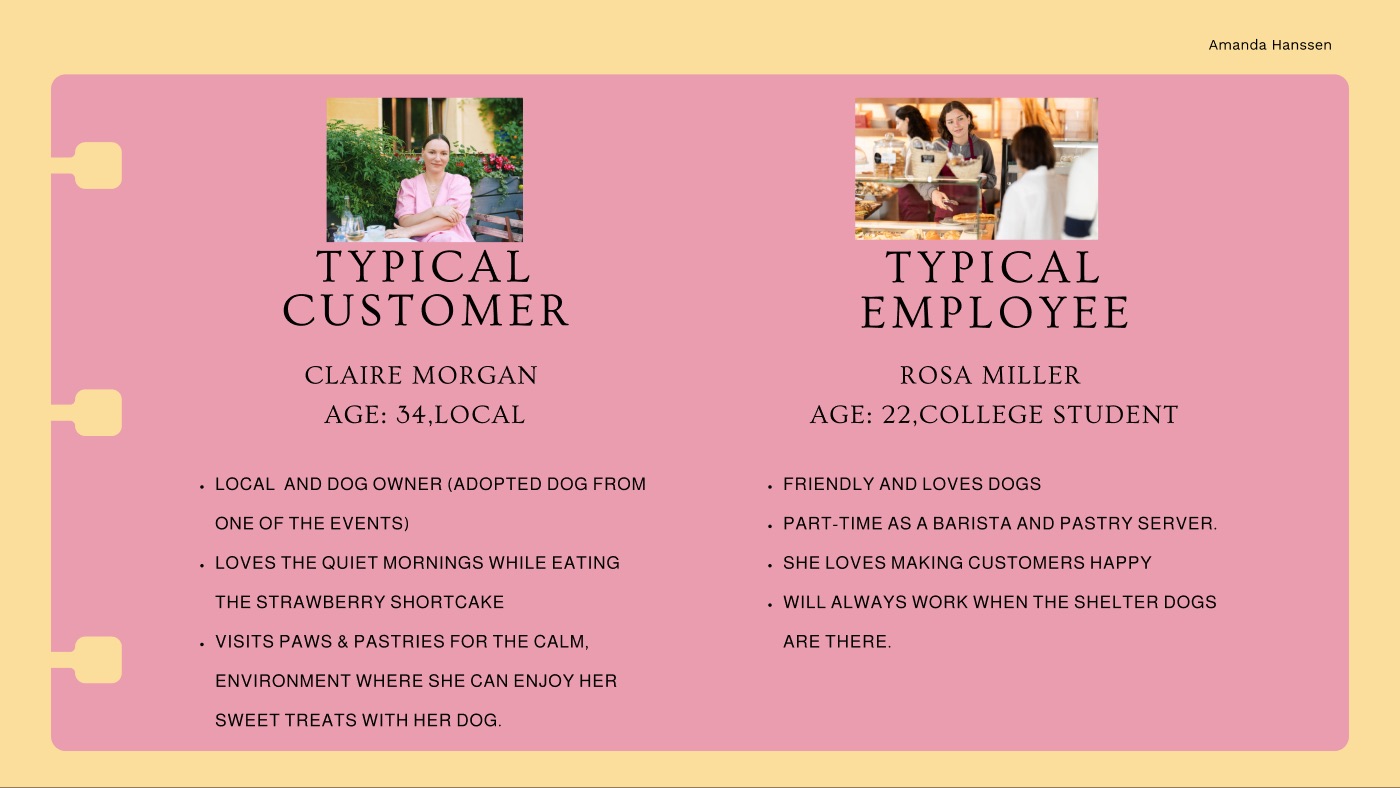
Personas: Claire, a local who adopted her dog at one of the café’s events, and Rosa, a college student who works the counter.
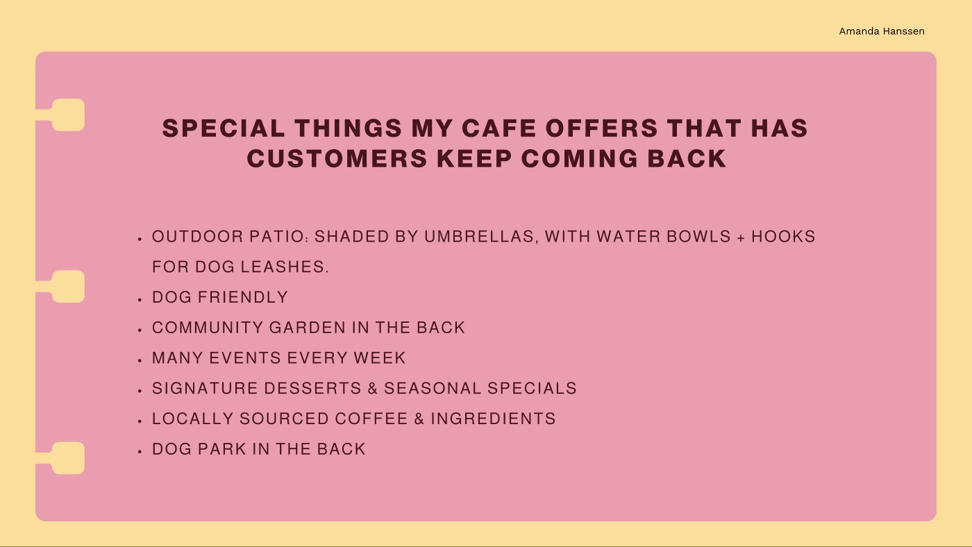
What makes customers come back: the patio, the dog park, the community garden and weekly events.
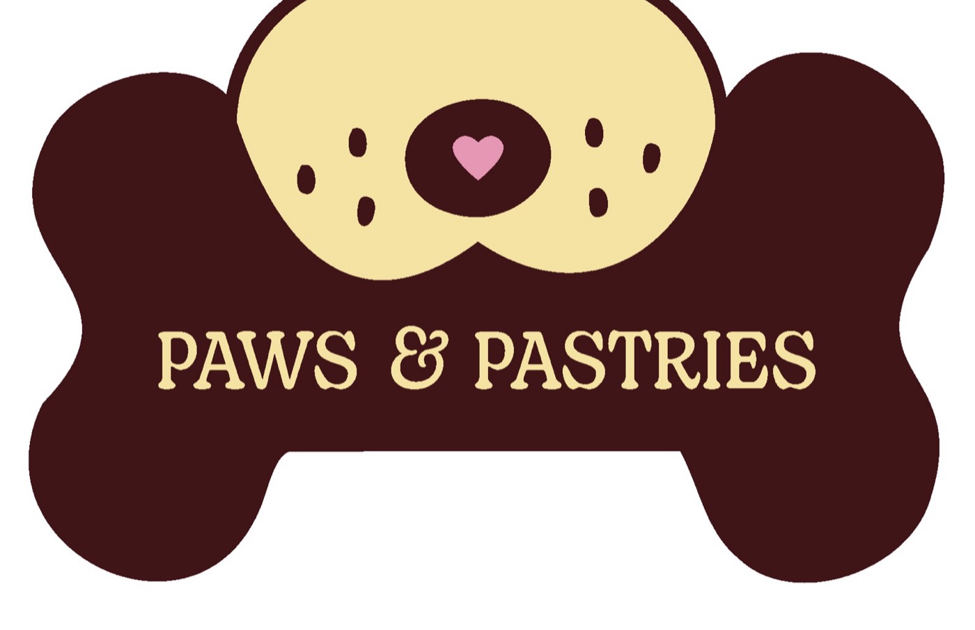
I sketched 100 marks, literal and metaphoric, then ran the name through hundreds of typefaces. The ten strongest went into Illustrator. The winner was a bone holding the name, simple enough to work at any size.

An early sketch: a dog and a pastry in one line.
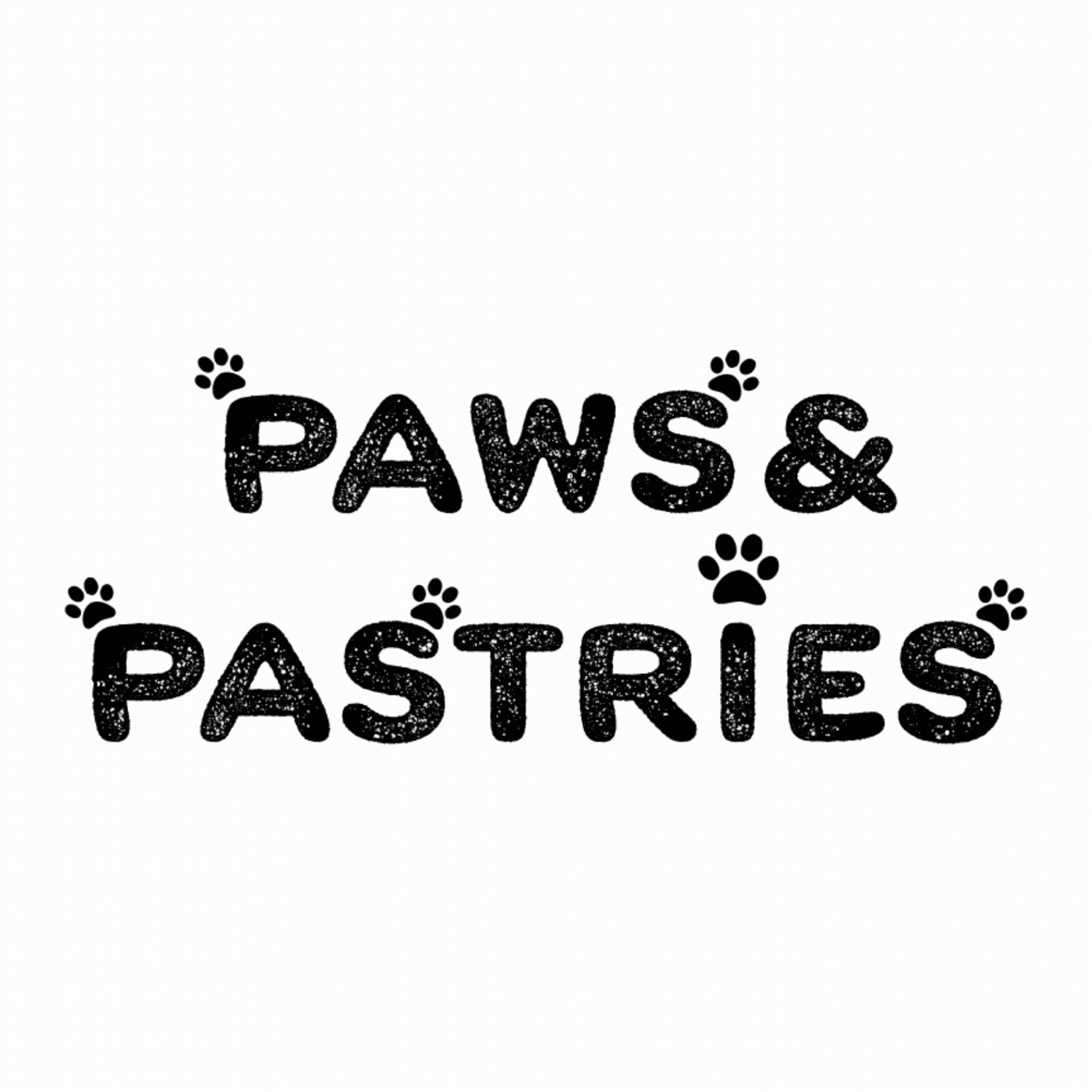
A type run, testing how the name reads in different letterforms.
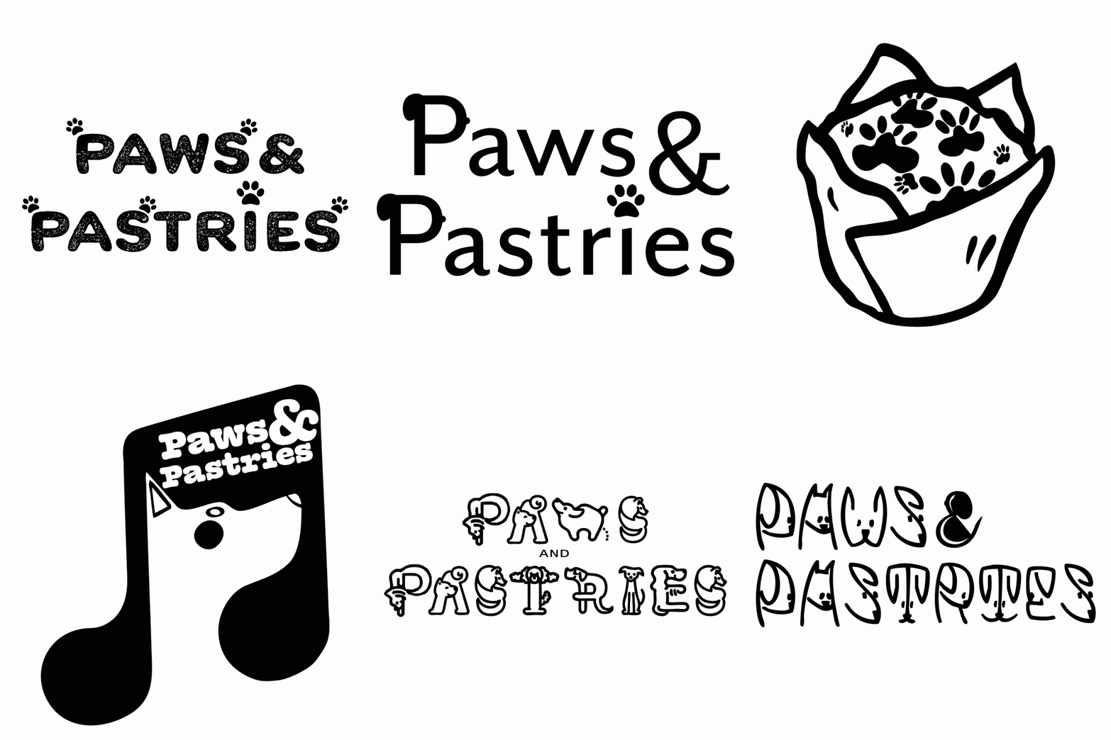
The refined marks, shown one after another.
One mark, two shapes: a horizontal bone for signs and the website, and a stacked version for menus and narrow pieces. I tested both in positive and negative, so the weight holds on any background.
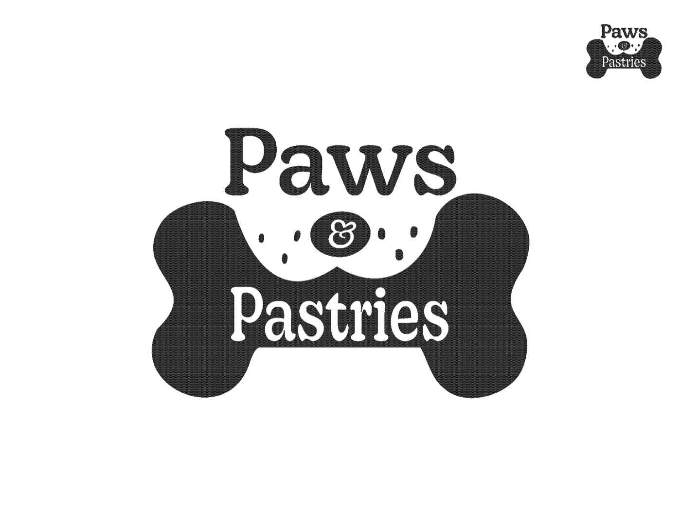
Horizontal lockup, in black.
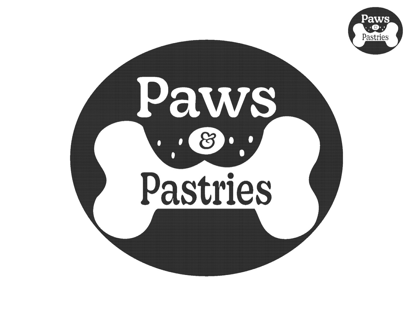
A round badge version.
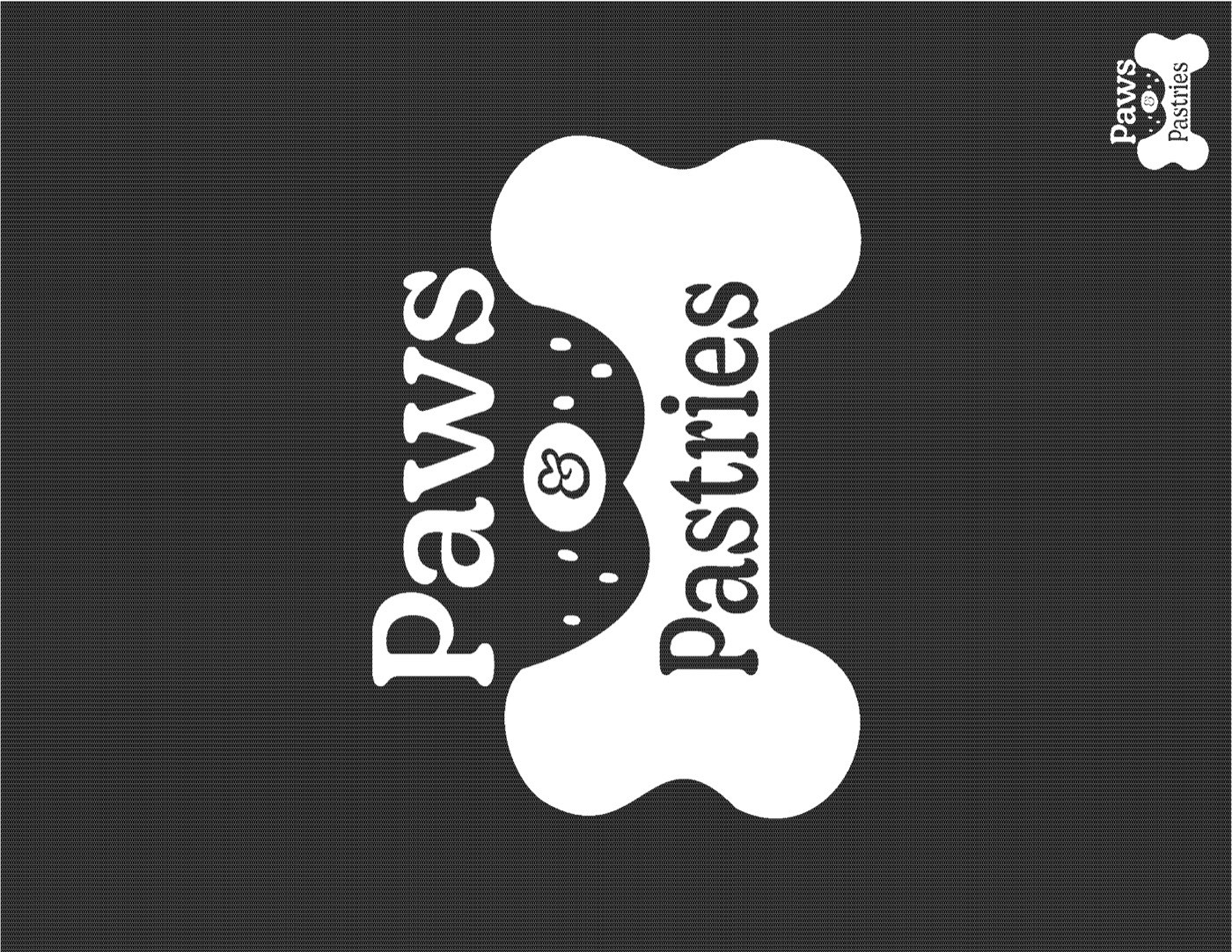
The stacked lockup in negative, white on black.
Everything had to feel like a cozy bakery, not a pet store. Deep chocolate keeps it grown-up, pink and butter make it sweet, and patterns built from the logo’s shapes tie every piece together.
Color
Chocolate
Primary: logo and text
Butter
Background and paper
Pastry pink
Accent: warmth and play
Berry
Highlights and menus
Cream
Light backgrounds
Type
Display
Decoy
A soft, rounded serif with a bakery feel, for the logo and headings.
Text
Almarai
A clean, friendly sans that keeps long menus easy to read.
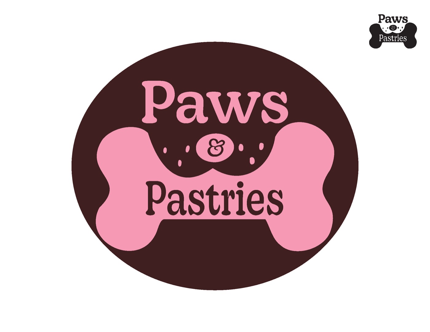
Testing the mark in chocolate and pink.
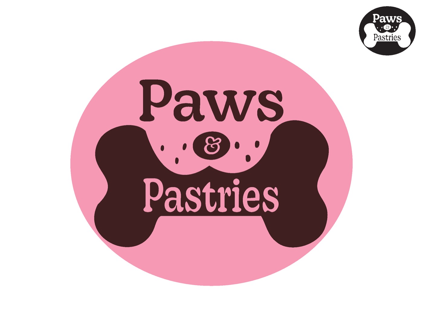
A lighter, all-pink version.
I set both menus in black and white first, to get the type right, then added color. The first color version was sweet but flat. The final one uses a pattern from the logo, so the menu feels like part of the brand.
Before
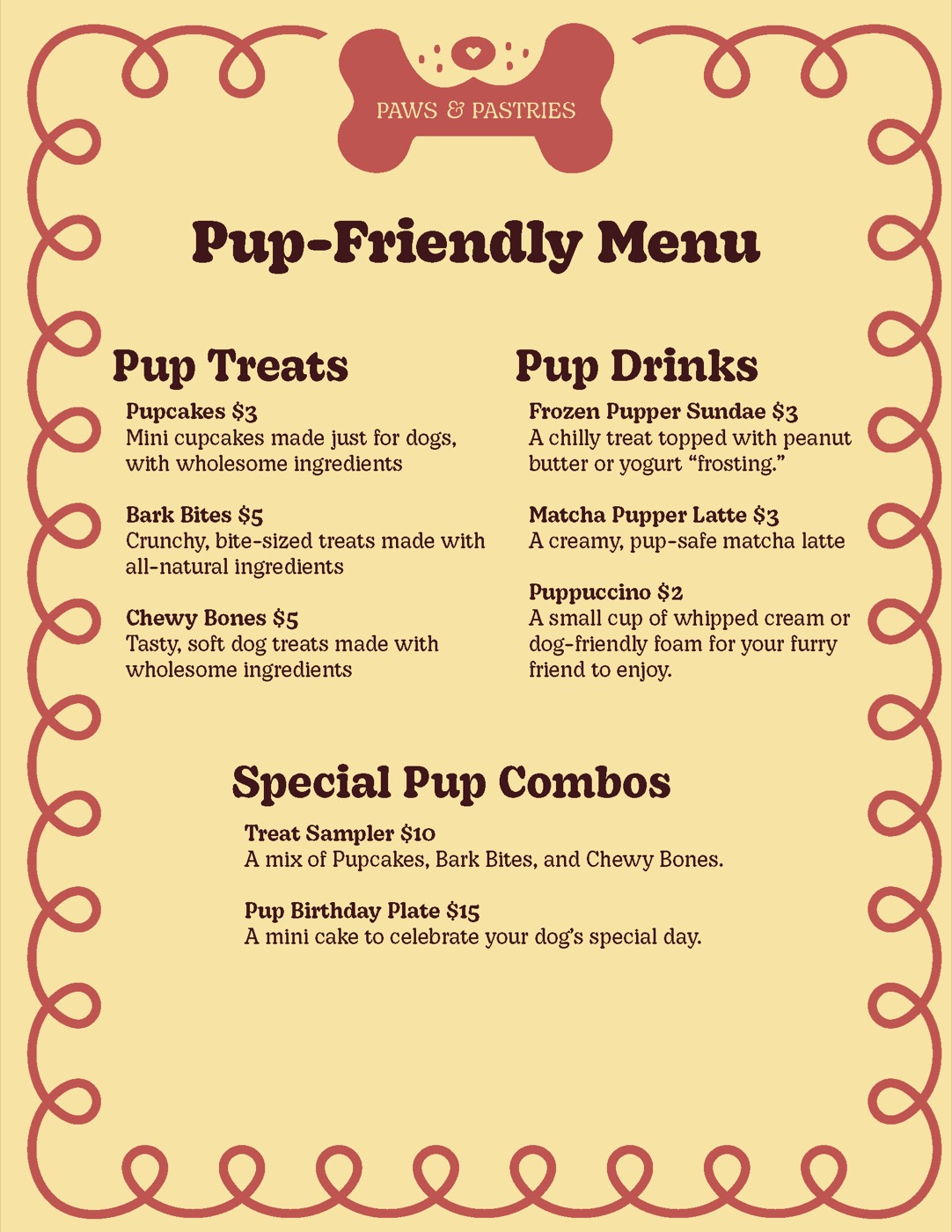
First color draft: a scalloped border and a single list.
After
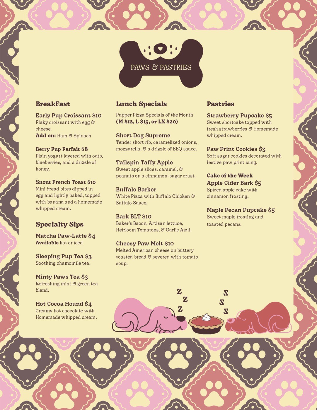
Final menu: the paw pattern frames three columns, with a sleepy-dog illustration.
The 24 × 36 in poster is a snapshot of the whole system: logo variations, the brand equation, typefaces, patterns, color palette, menus and applications.
Before
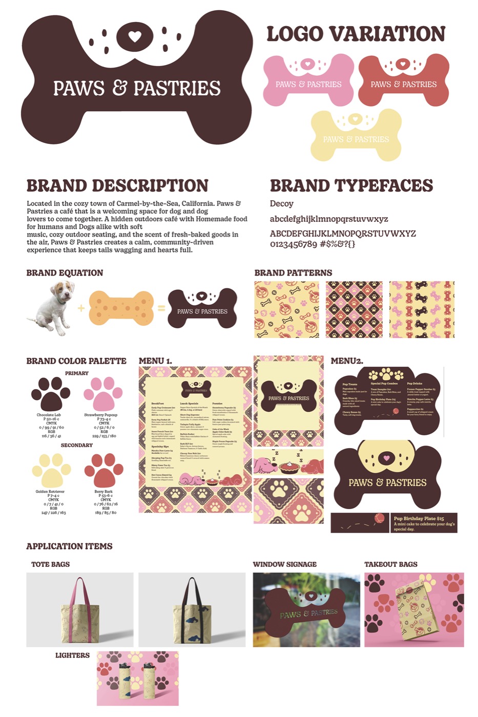
First version: everything on white, so it felt like a spec sheet.
After
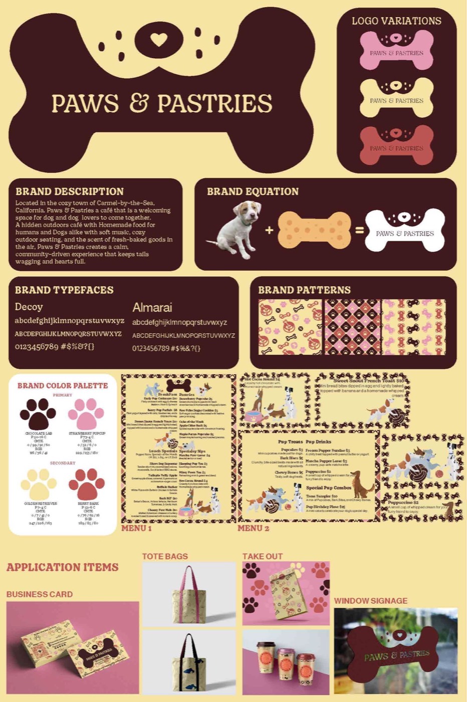
Final: the chocolate panels and butter background make the poster feel like the café.
Process
Week 1
Mind maps, timeline, personas and two moodboards.
Week 2
100 logo marks and a type run of the name.
Week 3
Ten marks drawn in Illustrator and tested at every size.
Weeks 4–5
Dual lockup, menus, patterns and graphic elements.
Weeks 6–7
A 24 × 36 in poster and physical menus.
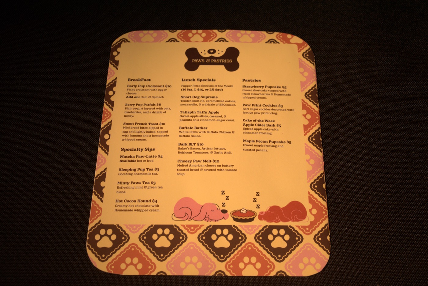
The printed main menu.
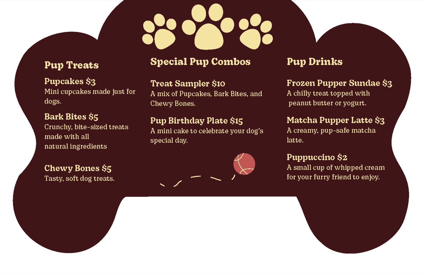
The bone-shaped pup menu.
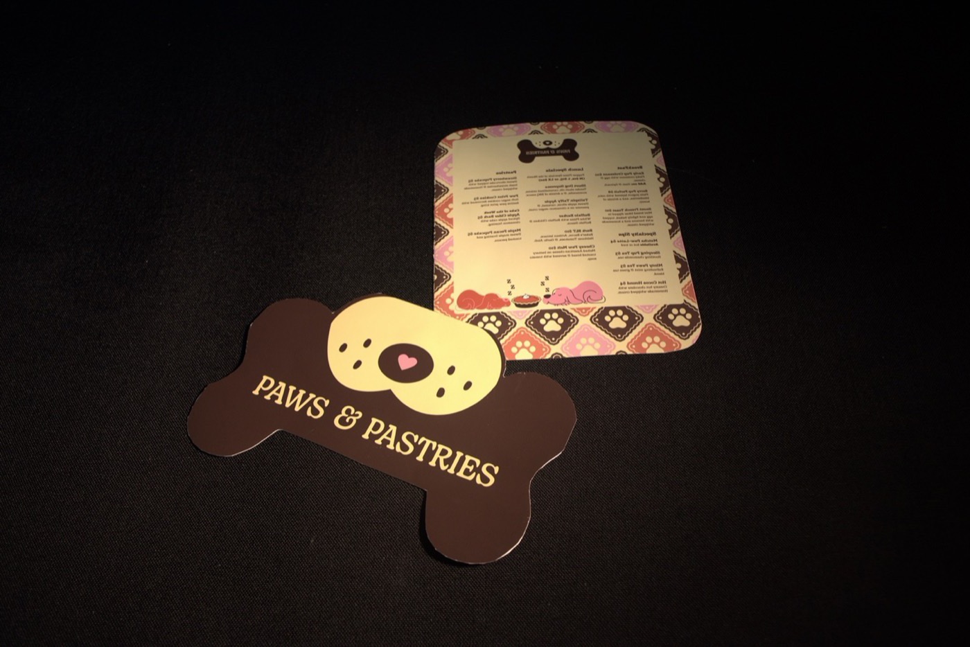
Both menus, cut and printed.
Reflection
“The bone shape only showed up after the easy ideas ran out.”
What worked
Drawing 100 marks pushed me past the obvious paw print.
What I learned
Designing in black and white first made the type stronger. Color is easier to add when the layout already works.
Next time
I’d give the applications their own section, with full-size mockups of the signs, cups and patio instead of small views on the poster.
Next project
Splash Zone →