Case study · Typography installation · 2026
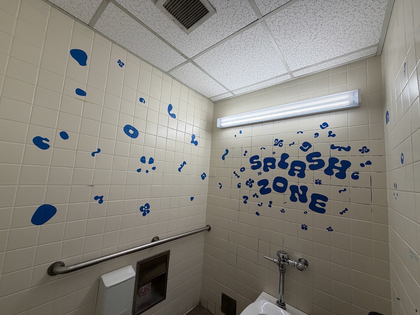
A team installation that splashes vinyl type across a campus bathroom, turning an everyday room into a playful, slightly uncomfortable experience.
My role
Team project: I designed and installed the piece with my group
Timeline
4 weeks · Spring 2026
Course
Typography III, with Katherine Hughes
Tools
Illustrator, Photoshop, Procreate, Figma
The brief
Typography III asked us to put type into a real space and see how the space changes its meaning. Our team walked around campus looking for places with a strong mood, or an interesting way people use them.
The project shifted how I think about type: not just something you read, but something you experience with your whole body.
We pitched three directions, each with its own location, moodboard and mockups.
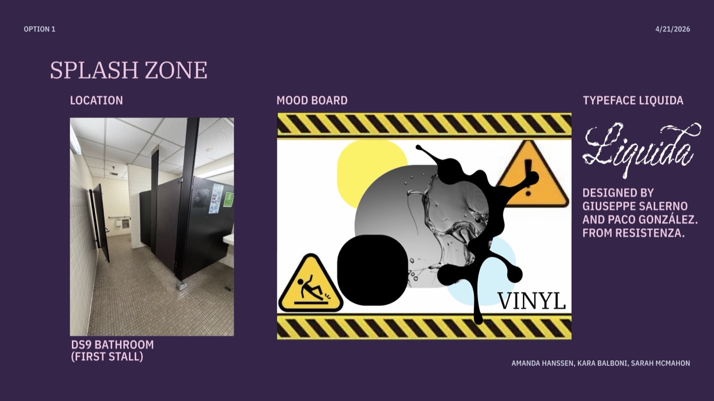
Splash Zone: a ground-floor bathroom, a hazard-sign mark and wet, dripping letters.
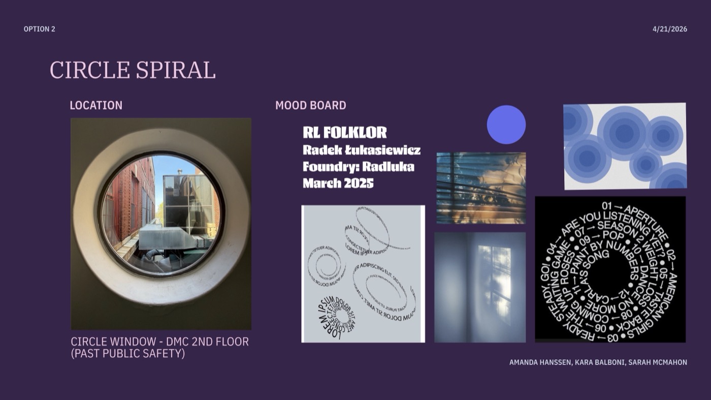
Don’t Spiral: a round window where repeating type mimics anxious thoughts.
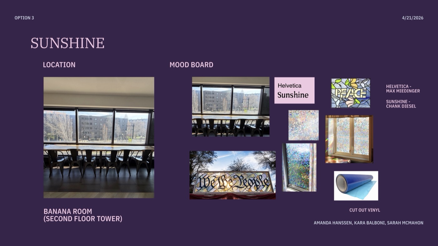
Sunshine: a warmer, uplifting piece for a sunny second-floor lounge.
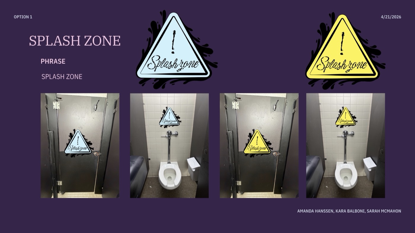
Splash Zone, step by step: the sign builds up across the stall doors.
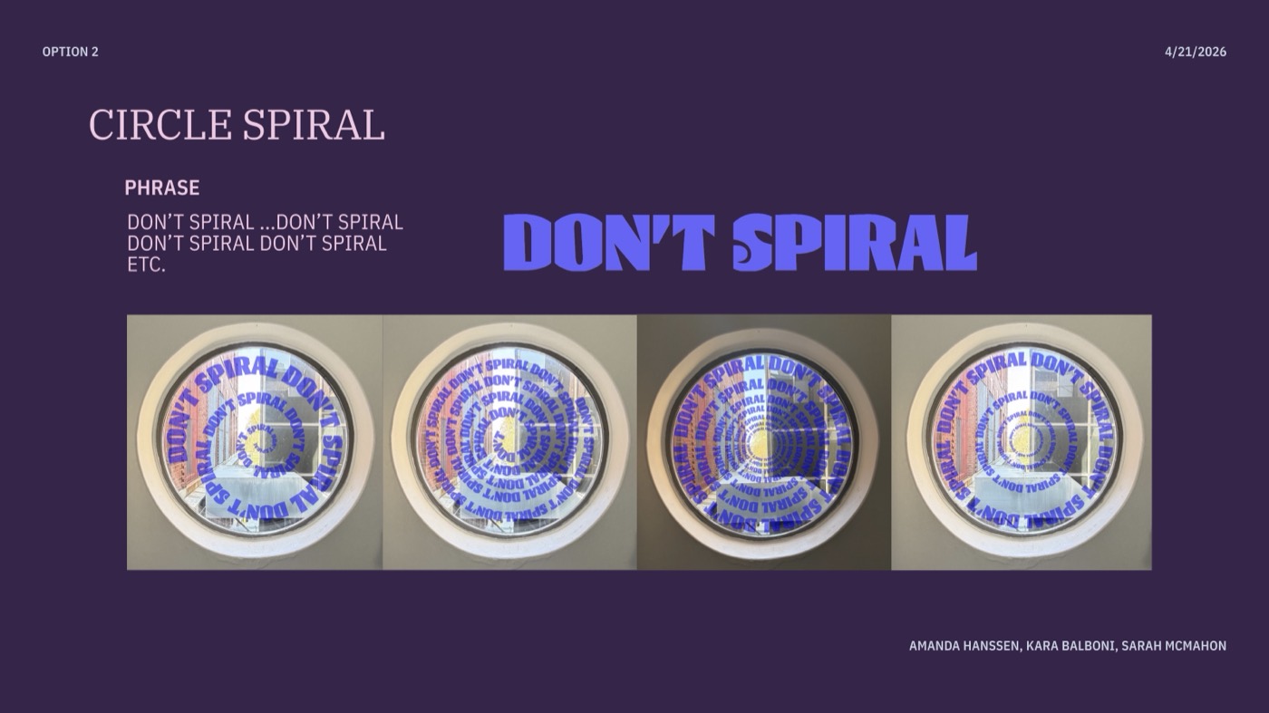
Don’t Spiral, growing more intense the closer you get.
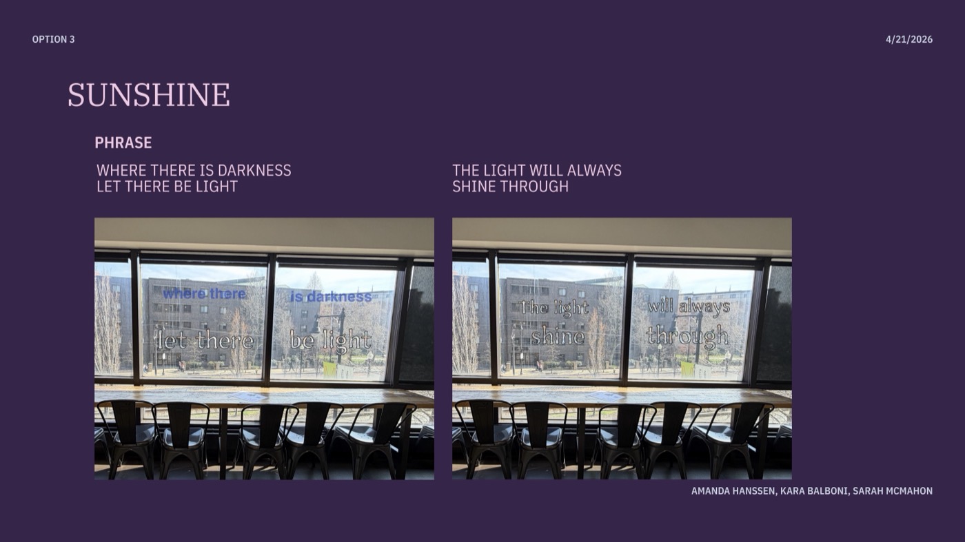
Sunshine, with type that catches the light through the window.
After critique, Splash Zone won: the most playful tone, the strongest tie to its space, and the most immersive. We then tested placement, scale and vinyl at full size.
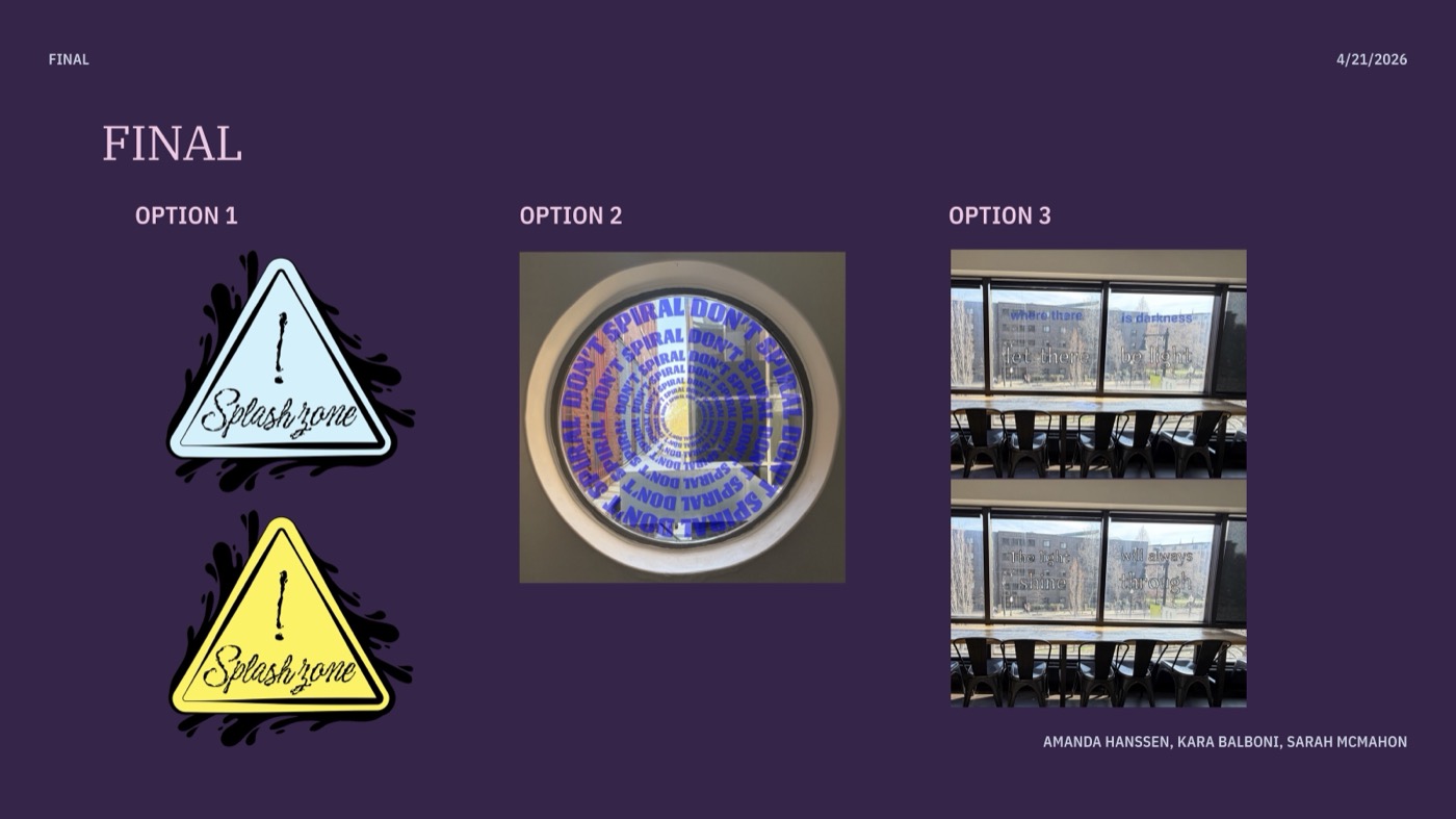
The final options side by side.
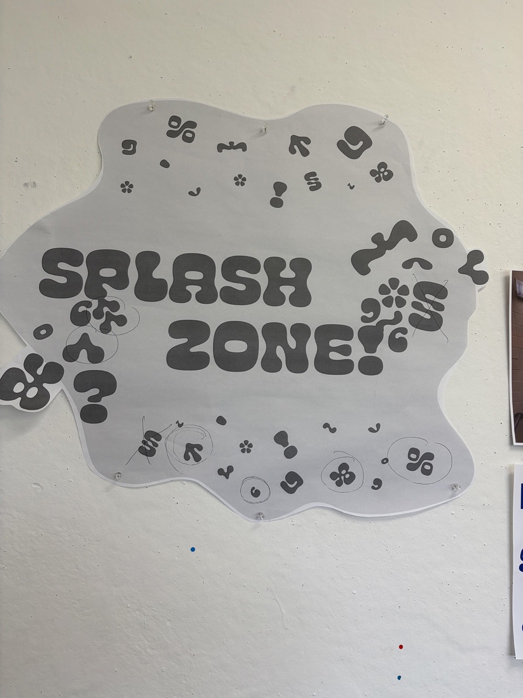
Week 2: a gray paper mockup of the logo and drips, tested on the wall.
Our first idea was a single hazard sign. Testing it at full size showed it felt like a real sign and got ignored, so we let the letters splash across the whole room instead.
Before
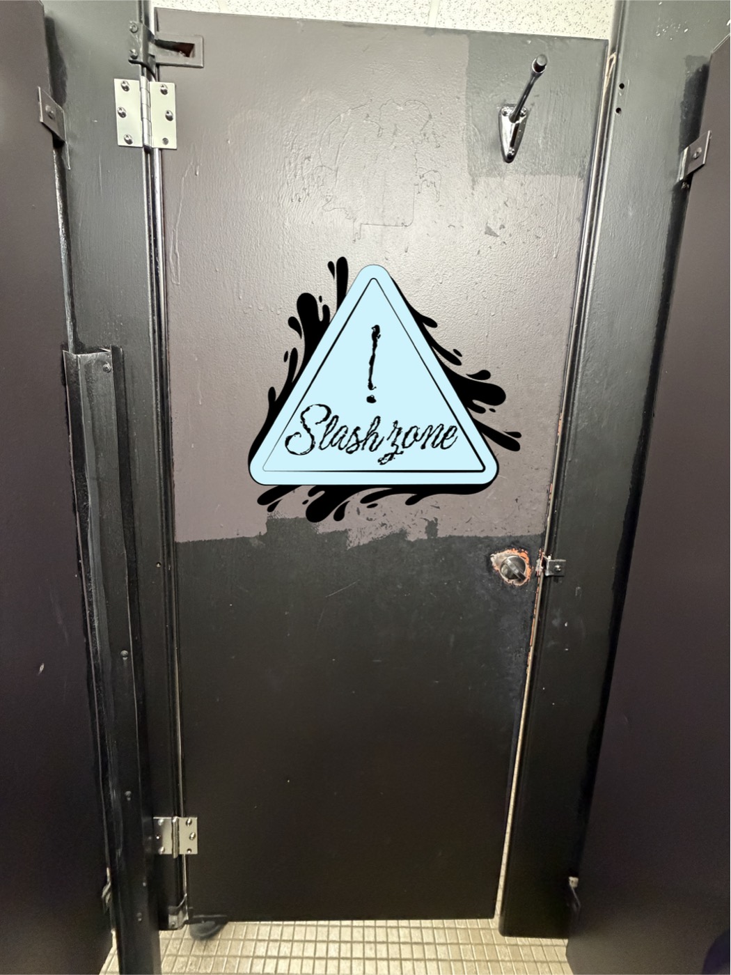
The first idea: one hazard sign on a stall door.
After
The final room: blue vinyl letters spilling across the tiles.
Process
Week 1
Scouting campus spaces, three concepts, mood boards and mockups.
Week 2
Chose Splash Zone; full-size mockups for placement, scale and vinyl.
Week 3
Improved the design and locked in the final version.
Week 4
Installed the final vinyl in the bathroom.
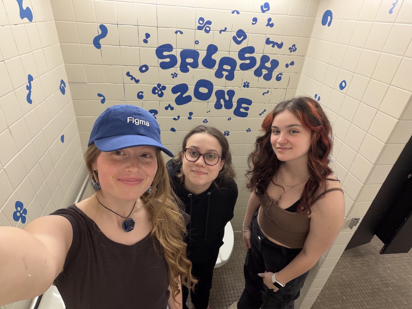
Our team in the finished room.
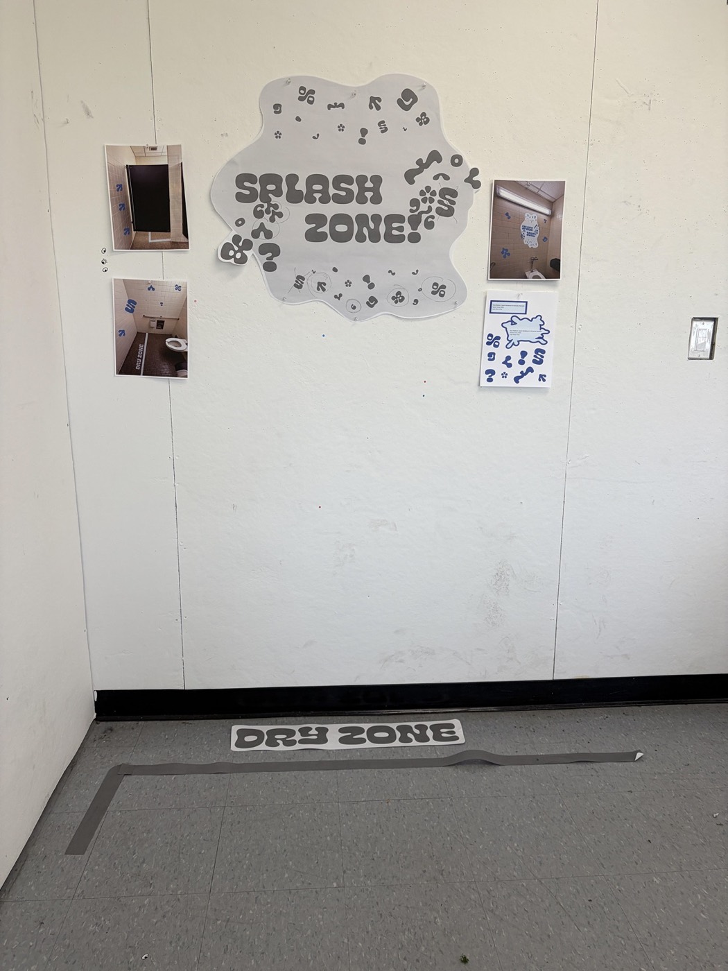
Mockups and room photos pinned up for critique, with a “Dry Zone” floor sign.
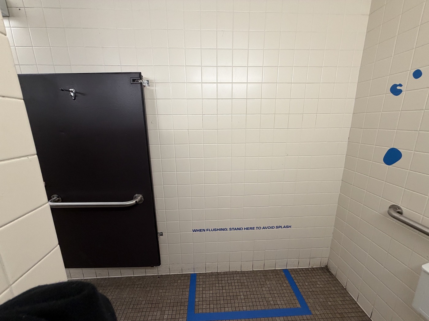
Blue floor tape and a small wall sign mark where to stand.
Reflection
“Space changes meaning. The same letters feel funny in a bathroom and anxious in a window.”
What worked
Testing at full size. Paper mockups on the real wall showed us what a sketch never could.
What I learned
Where type lives is part of the design. The room shaped how people read every letter.
Next project
Gator Graphix →